Dan Brady (2017) Medium. Jamie Read God Save The Queen.
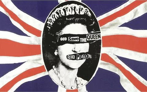
One design from the post war period which evidences design for good and societal impact includes the God save the queen single cover for the iconic punk band, The Sex Pistols. It is considered by some to be “the most iconic punk image of all time” designed by Jamie Reid; a graphic designer who broke the “notions of order and polish in design.” Benjamin Hiorns (2025)
Designed in 1977 this piece was made: “during the height of the punk music scene and in the year of the Queen’s silver jubilee, making it a very topical and controversial piece.” The iconic image of the queen, here, taking a backseat in her own likeness, behind typography reminiscent of the torn newspaper of a ransom note. This, combined with the visual notion of “The tearing away of the Queen’s features” , is highly symbolic. It is holding conservatism hostage and presenting a new idea, that “the monarchy should be abolished”. It was the rise of anarchy. Dan Brady (2017)
Jamie Reid, famed for his iconoclastic approach in design as a self proclaimed anarchist, used a technique that is Collage’s rebellious cousin; Decollage; a process that involves tearing away at photos, in a messy protest that can create something gritty, and entirely new. His art helped define the aesthetic of the Punk movement and had a profound effect on society, with the Labour MP Marcus Lipton saying: “if pop music is going to be used to destroy our established institutions, then it ought to be destroyed first”. Artnet (N.D.)
His designs were revolutionary, (literally), and “Jamie Reid’s artwork visually defined an era, frightened a government and changed the face of design – 30 years on he is just as influential and controversial.
Few people have ever faced imprisonment in the name of graphic design. Jamie Reid is a notable exception.” Kenn Taylor (2010)
Task 2
The contemporary influential graphic design example I have chosen is the Stabilo Boss campaign: Highlight the remarkable:
“This professional campaign titled ‘Highlight the Remarkable – Lise, Highlight the Remarkable…’ was published in Germany in April, 2018. It was created for the brand: Stabilo Boss, by ad agency: DDB.” Adsoftheworld (N.D.)
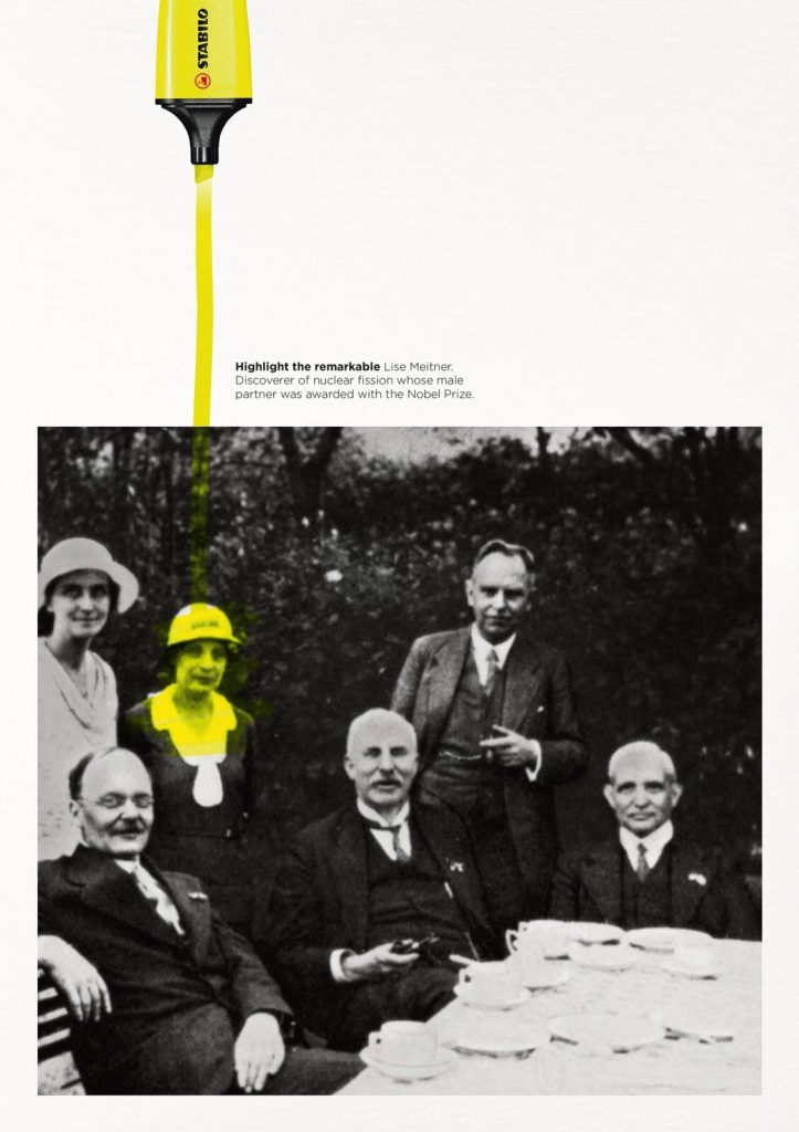
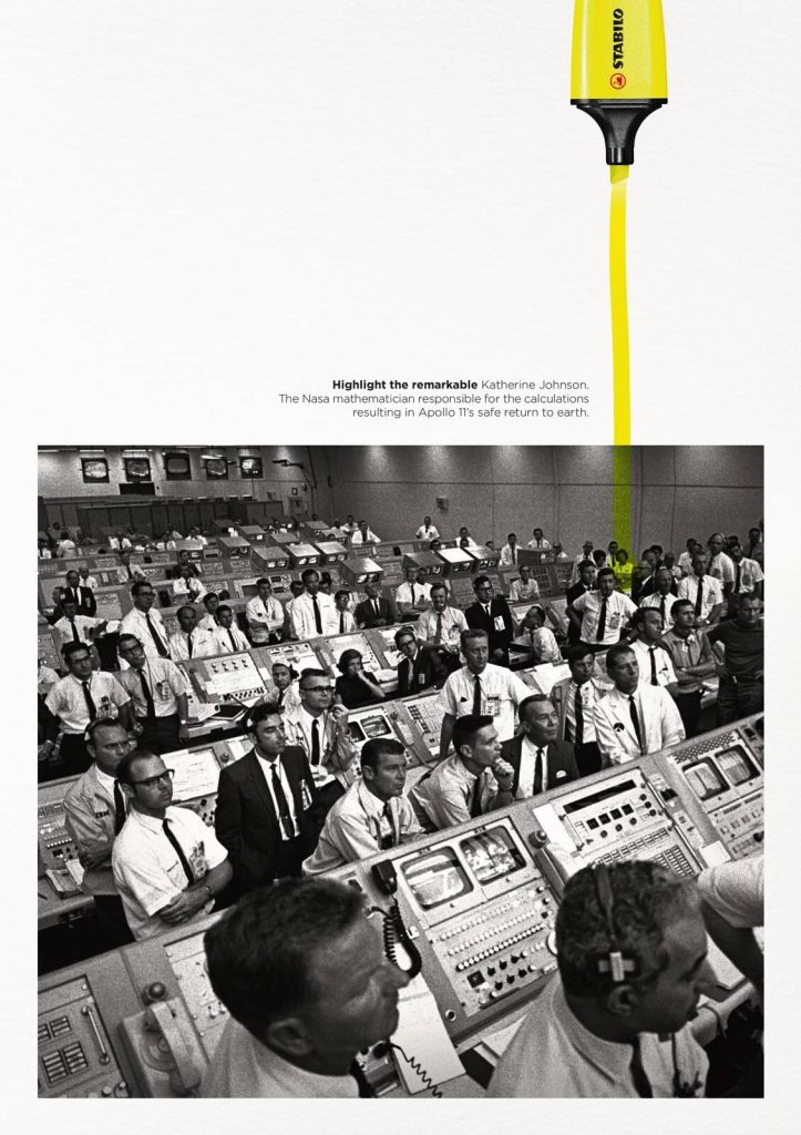
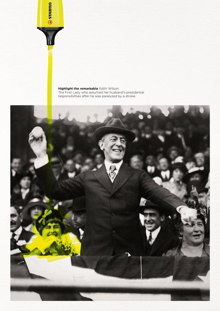
This was a campaign to advertise highlighter pens, and it depicts three minimalist posters that use a Swiss design, a single swipe of fluorescent yellow, simple photographs, whitespace, and type to literally highlight some of History’s most remarkable women, who were uncredited and overshadowed by their husbands and male co-workers.
British Design and Art Direction states: “the yellow stroke of the Stabilo Boss highlights three women: NASA mathematician Katherine Johnson, US First Lady Edith Wilson and Austrian-Swedish physicist Lise Meitner. We don’t highlight them in texts, but in historic, black-and-white photos, where men are in forefront or center of the visual” D&AD (2017)
It could be argued that the campaign uses virtue signaling to profit off of women’s achievements to sell pens; Or it could be regarded as a widely successful campaign that drew attention to women flying under the radar in History, as well as honoring them by giving them that moment in the spotlight which they so deserved, and didn’t get to have.
Lise Meitner, discoverer of nuclear fission, whose male partner was awarded the nobel prize.
Katherine Johnson, the Nasa mathematician responsible for the calculations resulting in Apollo 11’s safe return to earth.
Edith Wilson, The First Lady who assumed her husband’s presidential responsibilities after he was paralyzed by a stroke.
Task 3
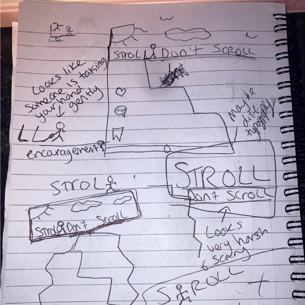
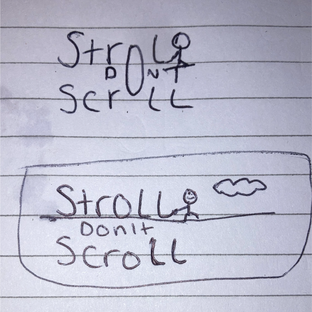
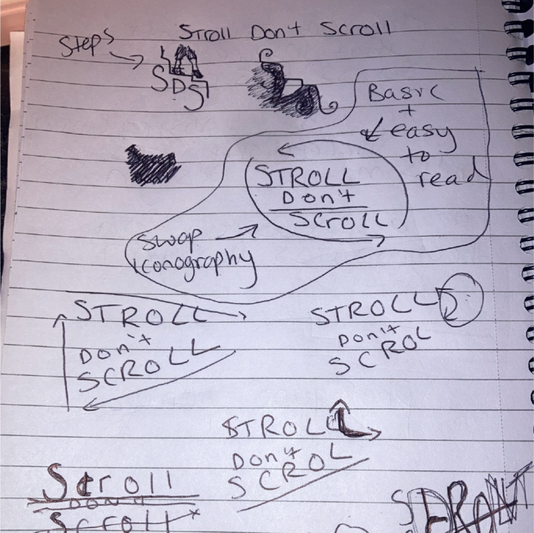
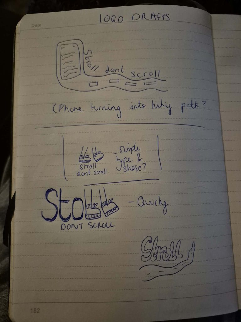
In this collaborative workshop I worked with my classmate Kate to look at the tag line “more green time less screen time”, and used it to come up with our own campaign slogan called “Stroll Don’t Scroll, which is a campaign which intends to encourage positive social change through offering an alternative to scrolling on social media through dreamy visuals and the peaceful nostalgia of nature and time outside.
Our demographic aims to target working individuals aged between 30-49, who spent a lot of time using computers in their daily life or jobs. The campaign will use visual mediums such as social media posters and videos woven into people’s for you pages on tiktok, instagram reels, and youtube shorts, to cause positive disruption at the source.
This is with the aim to therefore change users’ perception of peace, without shaming and criticising, but instead romanticizing the positive alternative of spending time outside, playing on childhood nostalgia.
We collaborated on a Figjam board, (which can be found embedded above). In this board, we collated our aims for our campaign, the slogan, our justifications, competitor research and statistical research, as well as our chosen demographic, and a stylized mood board for the tone and aesthetic of our campaign “Stroll Don’t Scroll”.
Source Magazine (2018) R.S.P.H Campaign Poster.
I did some competitor research and looked at the R.S.P.H’s Scroll Free September, which shows a poster using illustrative posters such as a smashed phone symbolising breaking free from being addicted to social media. This campaign encourages people to partake in a challenge which involves not scrolling on their phone through the month of September, similar to the concept of “Movember” which raises awareness for men’s health issues, and “Sober October” to raise funds for Mcmillan.
Heineken (N.D) Social Off Socials.
Rough Sketches
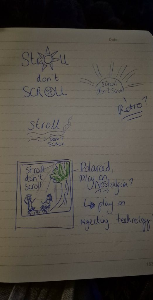
We also did some rough sketches of potential ideas that could be used to create a logo for our campaign, and came up with some iconography which could be utilised later on, such as stairs to symbolise physical activity and walking, and Kate drew some logos using legs to replace the two letter “L’s”, as well as providing some potentially retro options to work with.
My Sketches
Kate’s Sketches
We also had the idea to have a split poster showing contrasting imagery of stress vs nature, which lead to Kate creating a rough draft of a conceptual video which juxtaposed the noise of stress at work/overuse of technology, with the calm serene nature of being in nature and having less time using screens and social media.
Task 4
Harvard References
Adsoftheworld (N.D.) Stabilo Boss: Highlight the Remarkable. [Downloaded Images]