Composition is the aesthetic layout, and relativity, of graphical items that make up a visual message in graphic design; According to Amadine, composition can be defined as “ In graphic design, composition is understood as a creative process aimed at ensuring the integrity, interconnectedness and harmonious combination of all elements.” (Amadine, 2023, Composition in Graphic Design, Available Online: https://amadine.com/useful-articles/composition-in-graphic-design [Accessed 03/11/2023])
Good Composition Example
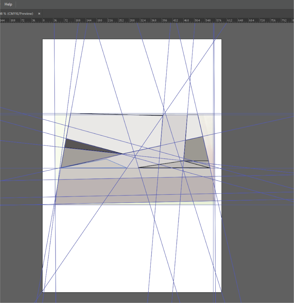
I think this picture has good composition for several reasons. I have broken down the composition to highlight the balance in the colours using guidelines,and the pen tool in illustrator, to break down this picture’s baseline composition, as seen in the screenshot above.
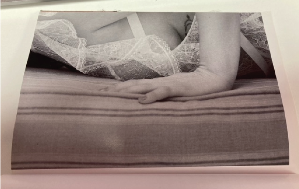
I chose this picture because it is good at drawing attention to the photograph subject, which is the lady on the mattress. I feel it does this by using the rule of thirds to create a horizontal colour gradient from dark to light, which draws your eyes to the main focus of the lady. I also think this is a use of good balance too because the gradient is making use of all the space in the photograph from bottom to top.
Furthermore the photograph also uses the layout of shapes to draw attention to the posing woman. On the guidelines breakdown it can be seen that the two prominent shapes, which also happen to be the darkest use of colours, are triangles, and their toplines are balanced with one another, and I think this creates a nice composition which is aesthetically pleasing for its context of a glamour shoot.
Lara Jade, a fashion photographer, states her opinion that triangles are effective in fashion composition; “A triangle is a great compositional tool and a good one to remember with posing. Using them in portraits and fashion photography can help strengthen an image and make it more pleasing to the eye. Look back at how the masters of painting used it to bring attention to their subjects using the head and arms in an angular composition” (L.Jade 2016, Lara Jade’s 7 Tips for Posing Models, Available Online:https://www.rangefinderonline.com/wedding-portrait/beauty-glamour-fashion/lara-jades-7-tips-for-posing-models-2/) [Accessed 03/11/2023]
I think that this has been applied to the composition of this shot, using the angle of the woman’s hand and arm, and also the shadows beneath her, to create a balanced use of triangles to create a nice composition on this photograph.
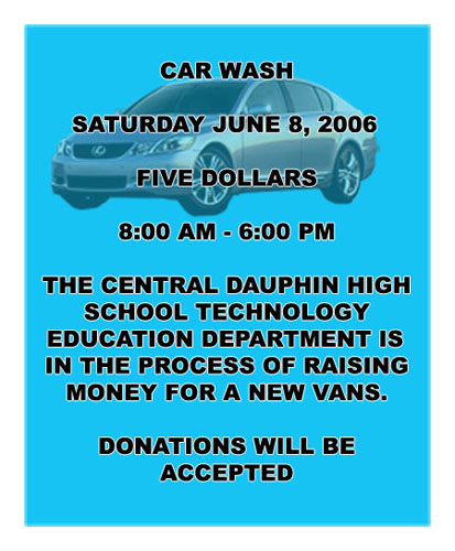
Bad Composition and Rework

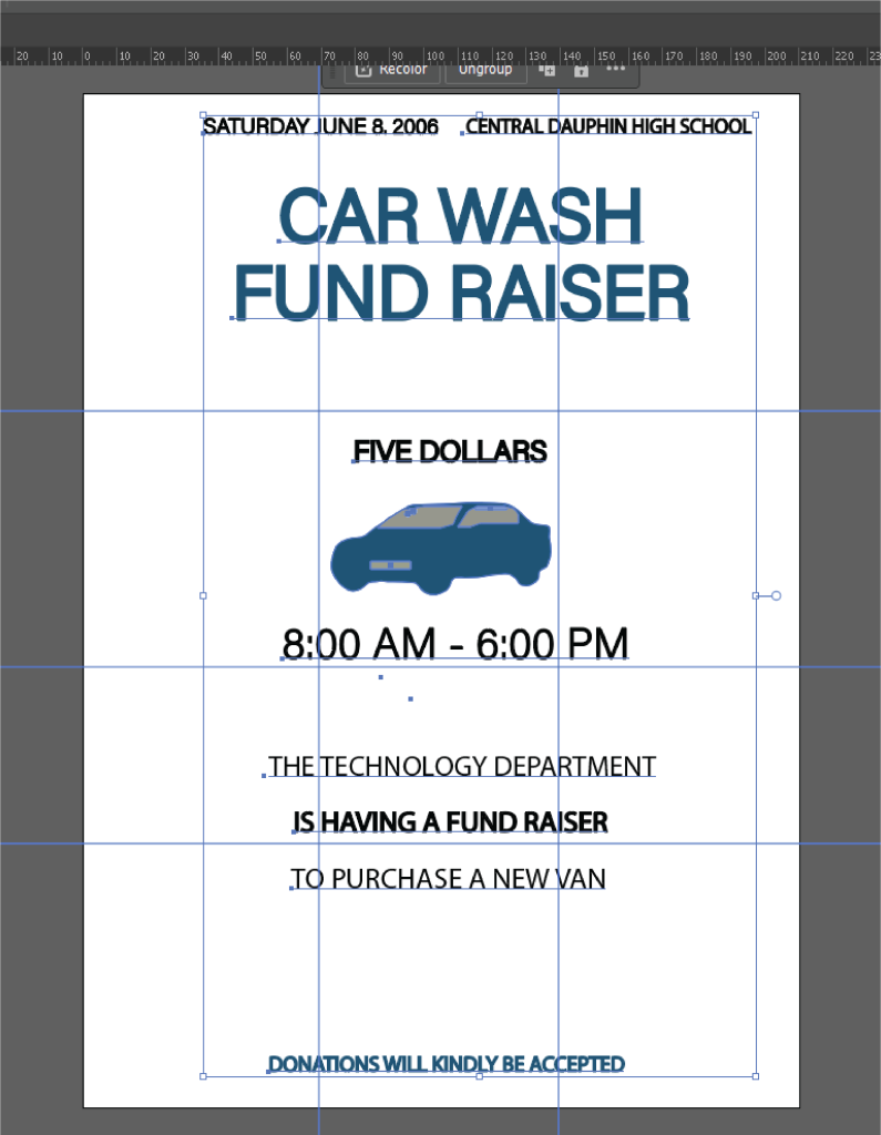
In my rework I decided to use guidelines to try to make everything look more symmetrical and evenly placed. In addition to this I also tried to create a hierarchy using the colour blue, and a big text heading, so that the poster reads from top down to the bottom, where the smallest text resides.
According to Blue Sky Graphics, hierarchy can create good composition in graphic design, “Scale and visual hierarchy are some of the creative fundamentals that can really make or break your designs, so it is important to have a good grip on them in order to maintain a successful composition.” (Blue Sky Graphics, London, N.D, What is Composition in Design. Available Online: https://blueskygraphics.co.uk/what-is-composition-in-design/ [Accessed 03/11/2023]
I also wanted to keep the central placed text from the original to keep it symmetrical, but i made the text more spaced out so it is easier to read and less offputting, as the original had all text in bold, which made it confusing as to which information was the most important.
Furthermore, I also used the blue colour, but removed it from the background, and instead used it to draw attention to the car image, and to draw attention to the title headings of the poster.
Blue Sky also states that “Symmetrical harmony evokes emotions of formality” ((Blue Sky Graphics, London, N.D, What is Composition in Design. Available Online: https://blueskygraphics.co.uk/what-is-composition-in-design/ [Accessed 03/11/2023])
The formality was missing from the original poster due to the chunky font, and the car picture behind the text,, and it is important for the composition of a poster which is for a fundraising/charity event to retain formality, as it involves money, and is addressing the public, especially since the format itself is quite informal (poster), the composition needed to have a level of professionalism.
Harvard References
| (Amadine, 2023, Composition in Graphic Design, Available Online: https://amadine.com/useful-articles/composition-in-graphic-design [Accessed 03/11/2023]) |
| (Blue Sky Graphics, London, N.D, What is Composition in Design. Available Online: https://blueskygraphics.co.uk/what-is-composition-in-design/ [Accessed 03/11/2023] |
| C.Newbold, 2012, Five Quick Tricks to Spruce up a Poster Design, Available Online: https://thevisualcommunicationguy.com/2013/09/05/five-quick-tricks-to-spruce-up-a-poster-design/ [Accessed 02/11/2023] |
| (L.Jade 2016, Lara Jade’s 7 Tips for Posing Models, Available Online:https://www.rangefinderonline.com/wedding-portrait/beauty-glamour-fashion/lara-jades-7-tips-for-posing-models-2/) [Accessed 03/11/2023] |
| (Meg Reid, 99 Designs, n.d., Available online: https://99designs.com/blog/tips/design-composition-and-layout/, [Accessed 31/10/2023] |