My aim for my conceptual logo was to use the icon of a swan on water, so as to show the horizon line, and therefore I could convey the relationship between the earth and the sky. I wanted to embody that feeling of breathing out a sigh of contentment when looking up at a beautiful sunset, and evoking that wonderment in my clients through the use of sunset colours. I then found a way to incorporate the sunset and the clouds inside the body of the swan. I want my clients to know that they can rest easy when they put a design in my hands, and that i will do the best I can for them to embody their values in the logos and graphic assets i will create.
I also wanted there to be a sense of irony to the idea of existential wonderment, and i executed this by something i have been doing with my art for a while, which is to have the moon and the stars hanging on nails as though they are hanging from the set of a play, on a stage. So I added these to the neck of the swan. I also think it adds to the nice aesthetic of pinks and purples, and connotes iconography from the sky.
Within the swan, which i sketched and used trace image outline, i then started to experiment with recolouring the multitudes of shadows that came through with the image being traced, and trying to create a sunset colour mix/gradient, and i then added some clouds, to create this sunset within the swans body. I did not go as well as I would have liked it to go. I think I should have created the shape within illustrator and maybe created the gradient another way, however it does bring its own textural effect to the conceptual logo which is interesting.
I also added my name typography underneath the logo, and outlined the box with the same colour outlining the typography to tie the logo together, to create the perception of someone looking into a box, as one might look down from space, into earth.
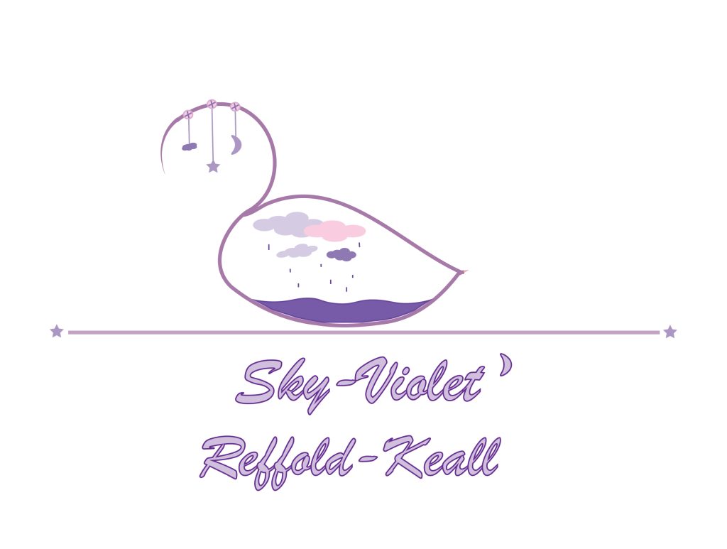
This secondary logo evolved from my first logo attempt, and I still kept the swan body encompassing the sky, only I decided to place just clouds inside the swan, for a more simplistic kind of design. I wanted to create a purple themed conceptual logo to go with the corresponding name typography. I also wanted to show something more human within this logo which I chose to represent by clouds raining into a body of water. My theme of my name, and those colours, are within the colours of the clouds i put in the swan body, but also there’s a sadness there, and that is something that is a part of me, and something i embrace wholeheartedly, i believe in taking the ups with the downs, and to not run from it as it’s a part of who i am, and so i felt that the rain was a nice conceptual homage to the complexity of human emotion, and taking things in your stride. Sometimes a logo will work out, sometimes it won’t.
I feel that the purple in this logo is more on the cooler side of the colour spectrum, and whereas my first logo embodies warmth with the pinks, I think that this one maybe embraces cooler colours, and cooler emotions. However, as a business logo, I don’t think that clients will look into this too deeply, so I think it is multifaceted in that it can serve its purpose as a memorable logo, with aesthetic colours that connote ‘Sky-Violet’, as well as having a deeper conceptual meaning, as i consider this art. I think that I cannot make art that represents me, impersonal.
Despite this, i do not think that this is the best logo in the world, and i think that if i had better skills using illustrator, i would have been able to encompass and represent these logos to a better ability.