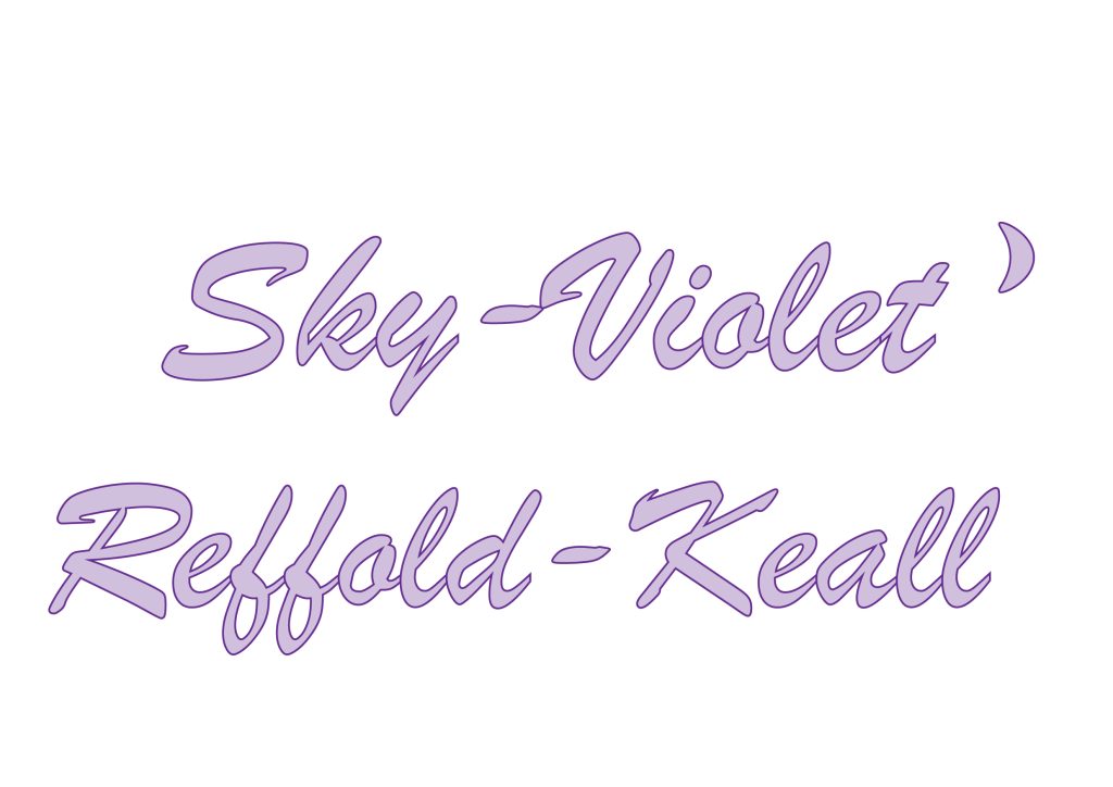
The audience for these typographical name logos are ‘potential employers’; my thought process behind this typography is that I wanted to create a name logo that I felt represents my stylistic preferences, and to give insight into my personality through my tastes. The typography displays my name, and because I have a long name with two hyphens, I tried to (almost) line those up to create a feeling of balance and symmetry in a sense.
Furthermore i wanted to use the colour visuals that originate from my name, which is the purples and pinks that can be seen on certain sunsets. I chose to do this font in purple, which was an evolution from my first name logo, which was in pinks, and I decided to use a moon instead of a star, as I wanted to use iconography that pertains to my name ‘Sky-Violet’. I also decided to make the width of the font larger so as to make it seem a bit more like bubble writing, and therefore aesthetically pleasing, and more girly looking.
Through the use of a script font i have created a name logo which is neither quite sans serif, or a serif font; the text does have swirling accents which are hyper feminine and could be considered born of serif font styles, but it also maintains qualities of a sans serif font. I feel this reflects my personality, neither fitting in here nor there in my life. It is a unique name logo which is multi faceted, and displays the ‘kawaii’ pastel tone colours which are my favourite colours, which i have fought to be able to love;
Trying different styles and denouncing ‘girly’ colours to be someone who I am not, has been a recurrent theme in my life, but now these colours are my colours, and I want to show that through this typography.
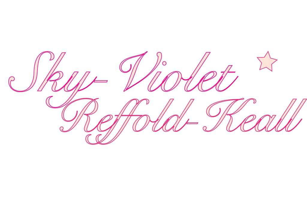
This was my first typographical name logo design, and it is using a script font that is a bit more curly and traditional than the secondary logo. I did not make this typography too wide as I wanted to keep it looking elegant and aesthetically clean. I used pink as this is my all time favourite colour, and most things I own are baby pink or a shade of pink, so it felt correct that I should choose it for my own name logo.
I also chose a brighter pink outline to the logo to make it stand out, and to make it eye-catching, and also staying in theme with sunset style colours. A difference from this logo from its secondary evolution, is that it does not have symmetry, and actually plays around with space, having indentations on the bottom left, and top right, which I felt looked quite nice. It also allowed for the tail of the ‘y’ to be mirrored with the ascender accent on the ‘R’ of my last name, so although it is not symmetrical, it does bring a sort of harmony between the letters which is pleasing to the eye. I think that there is also a theme of white space being diagonal from each other, which presents a nice composition for the letters.
Overall I feel that this is my favourite typography from my two choices because of the eye-catching outlines and the diagonal white spaces, in addition to the tail and ascenders of my first and last names aligning to show harmony amongst the typography. I also kept in theme of my name, and decided that the space indentation on the upper right hand side might look nice with an icon to represent my brand, and so i chose to place a star, which i feel most people associate with the sky, and also with the wonderment of looking up at the sky, which is something that aligns with my personal values of loving the earth, and nature.