Early Design Prototyping
In this assignment, I will present research for three different company examples and what their home pages could look like; please find Figjam research board below.
Eco Future
Good Energy has a really nice hero with a curvature, making the website memorable, out of the other green energy websites, and could encourage users to find out more.
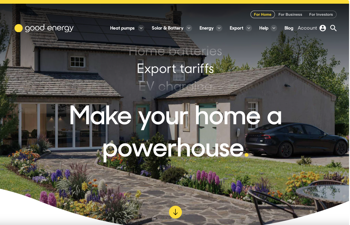
Example of interesting curved hero showing home with solar panels
GoodEnergy (2024) Renewable Energy Supplier Renewable Energy UK. https://www.goodenergy.co.uk [Accessed 9/12/2024]
It was common on most green energy websites to have a short video with nice visuals, to explain a little bit about the company, their ethics, and about green energy.
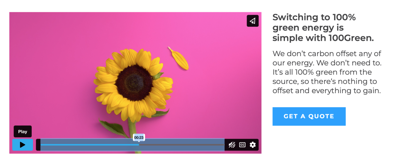
Screenshot showing a video on 100 Green’s website with nice visuals.
100Green (2024) 100Green UK’S Only 100% Green Gas & Electricity Supplier. https://www.greenenergyuk.com [Accessed 9/12/24]
Ecotricity also has a video on their website doing a similar thing, showing strong visuals of the environment, and wind turbines, showing people a little bit about green energy.
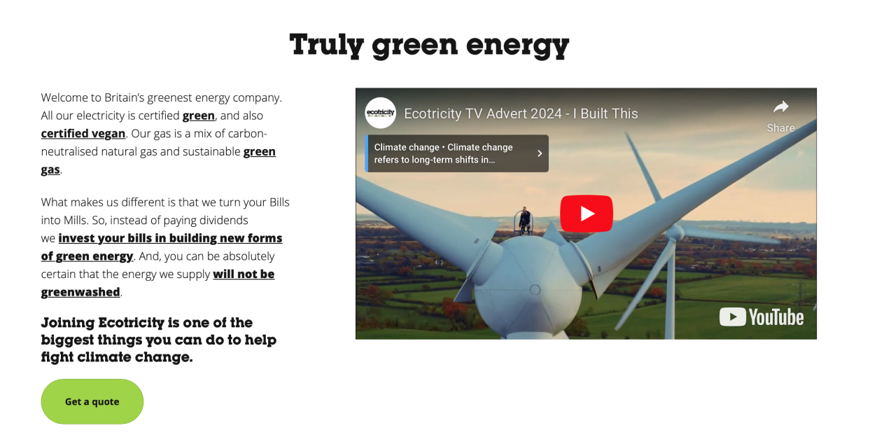
Video on Ecotricity’s website with visuals of wind turbines, and lots of green landscapes, plus a call to action button to the left.
I also like the use of the bright green as a highlighting colour for their branding as it is soft and eye-catching at the same time. Below is an example of it being used for a button leading users to find out about how the company generated their energy.
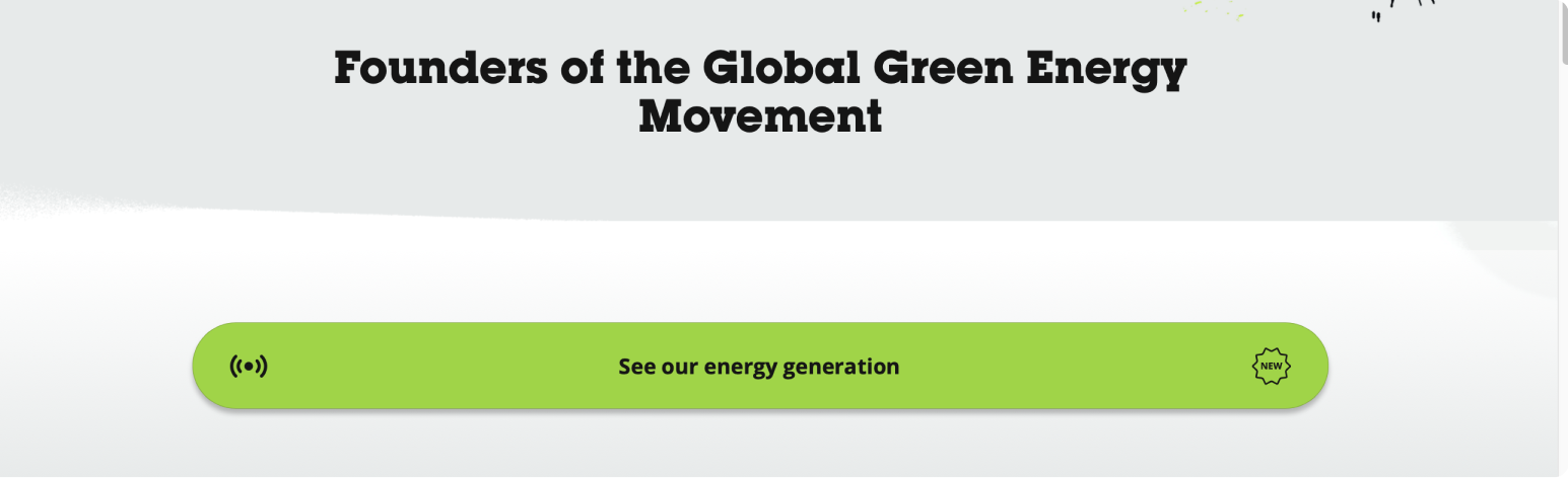
Screenshot of Ecotricity’s “see our energy generation” button, which is wide and encouraging to click on, and uses a nice highlighting colour to catch attention.
Another feature for Eco’s website includes the use of a scrollable customer review panel, towards the bottom of the website. I think this feature shows credibility and creates a foundation of trust for interested potential customers,
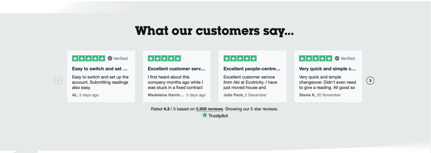
Scrolling reviews from happy customers to build trust.
Ecotricity (2024) Britain’s Greenest Energy Company Ecotricity. https://www.ecotricity.co.uk [Accessed 9/12/2024]
I want to add sections to the home page for information on the different types of green energy for homes, to inform people on their options so they can narrow down on what they want from the company.
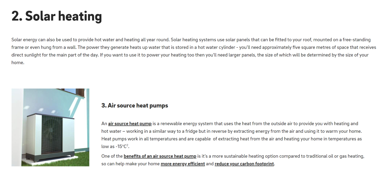
Modulated blocks of information accompanied by nice images, with bold subheadings to create info hierarchy
Eon Energy (2022) 7 Ways To Power Your Home With Renewable Energy. https://www.eonenergy.com/our-blog/ways-to-power-your-home-with-renewable-energy.html [Accessed 10/12/2024]
Information For The Website
- What is renewable energy?
- Types of renewable energy with info-graphics
- Quote calculator
- Information Video
- Links to tariffs and their prices
- How the energy is generated
- QR to get the app
- Customer reviews
- Welcome and mission statements/Problem statements
Cab- E
During my competitor research, I found Uber to be the best website for an online taxi company, due to its great use of white space, and limited options, as well as compartmentalised information, which is not overwhelming, easy to understand, and encouraging to use.
I feel these features should be incorporated and considered when designing the Cab-E website.
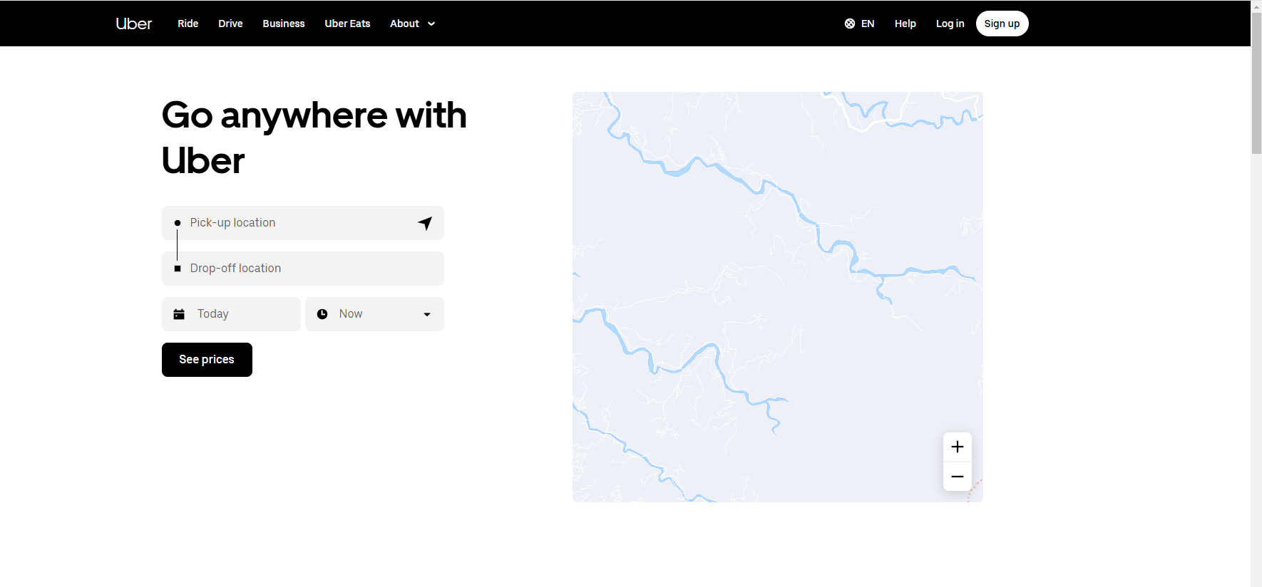
Easy to use price calculator.

Simple navigation bar with options for the different user profiles (business, driver, and rider), as well as language options (accessibility), log in and sign up.
According to Medium on Hick’s Design Law:
“Hick’s Law was formulated on the assumption that the brain has a finite capacity for information processing. When the brain is confronted with too many options, it becomes overloaded, which can result in decision fatigue.”
(https://medium.com/@incharaprasad/hicks-law-the-psychology-of-decision-making-11bb52822a18)
Therefore I think this principle is most effective when designing a website, and is why the Uber UI/UX is so accessible and understandable. I would be undertaking this principle if i was designing a website for Cab-E.
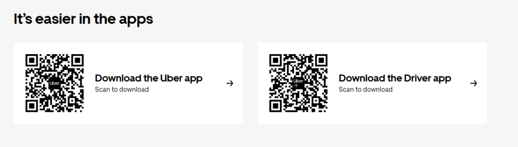
Other design features I think are effective for the Cab- E website include the use of a QR code at the bottom of the page, to encourage users to download the app quickly and easily, by scanning it with their phone.
Another good UI/UX feature for the website, shown by Uber, is the use of vector graphics with small chunks of compartmentalised information to make info more digestible to users. Vector graphics are also better for the environment.
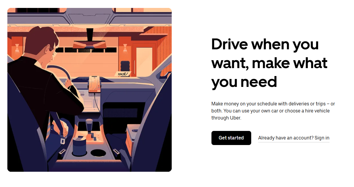
Vector graphic with nice text hierarchy and small amounts of information, as well as a call to action button and link.
Uber (N.D.) Earn Money By Driving Or Get A Ride Now Uber United Kingdom. https://www.uber.com/gb/en/ [Accessed 12/12/2024]
Designs To Avoid For Cab-E
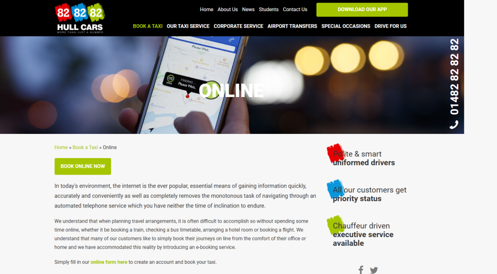
Image showing too many colours that don’t harmonize, and poor use of white space.
828282 Hull Cars (N.D.) Online Hull Cars. https://hull-cars.com/book-a-taxi/online [Accessed 12/12/2024]
Therefore, for Cab-E i would suggest picking a limited colour palette using colours which harmonize well together, that aren’t overwhelming, and can be used for information hierarchy such as highlights to certain typography, and vector graphics.
Information For The Website
- Booking a taxi in advance
- Calculator tool for finding a car in the moment
- Calculator for businesses
- Log in
- Sign up
- Social media
- Contact information- phone, email
- A map to show where the car is
- How to apply to be a driver
- About Us
- Customer service- Email, phone, live chat
- QR for downloading the app
- Accepted payment types
- FAQ’s
Influent Hull
The company I will be carrying through into the next design tasks will be Influent Hull, as I have never done anything in this minimalist style before, and I would like to do something outside of my comfort zone to show the versatility of my designs.
I want to use parallax, lots of white space, soft edges on shapes, a single highlight colour, and clipping masks on Influent Hull’s home page because it looks professional, unique, and creates a memorable UI/UX, as can be seen below. In addition to this, I want the website to have a contact me section at the bottom of the page so clients can get in touch easily.
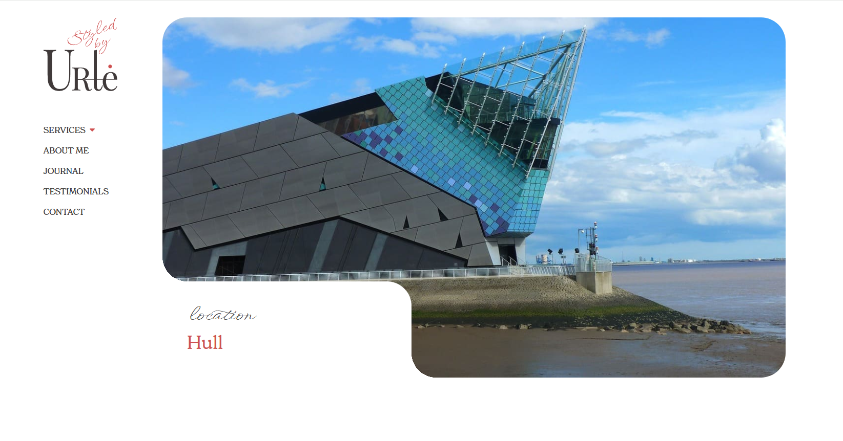
Interesting clipping mask
Styled By Urle (N.D.) Personal Stylist-Hull-Beverley. https://urte-personalstylist.co.uk/locations/hull [Accessed 16/12/2024]
Parllax Scrolling Feaure
Styled By Urle (N.D.) Personal Stylist-Hull-Beverley. https://urte-personalstylist.co.uk/locations/hull [Accessed 16/12/2024]
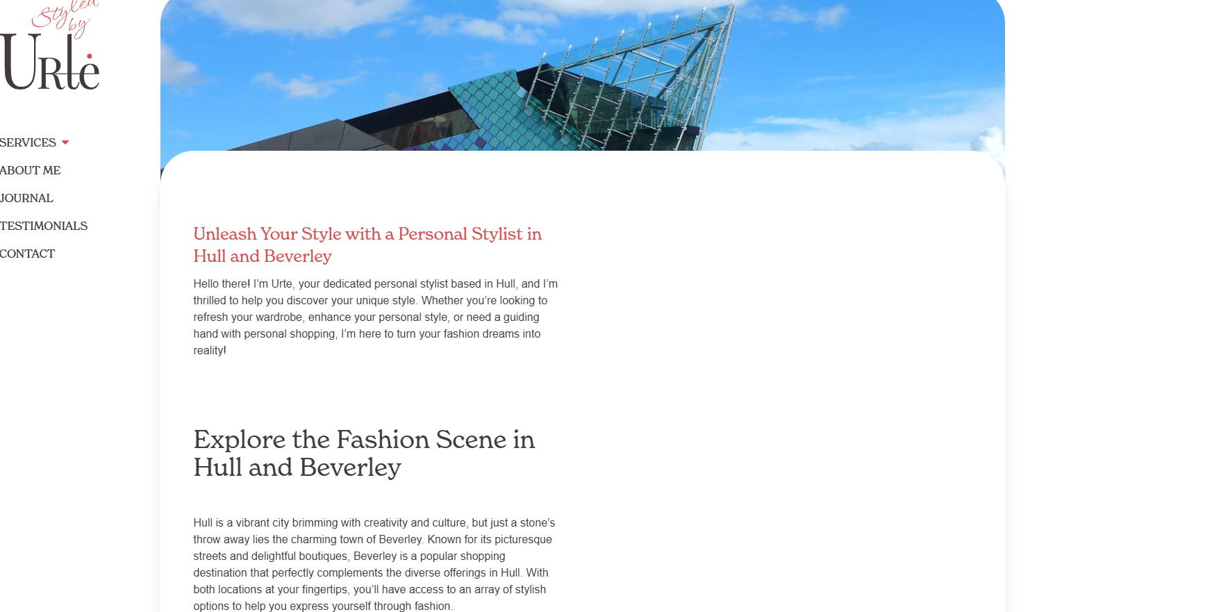
The home page will have compartmentalised information on the services offered, using highlighted sub headings to create information hierarchy and organisation.
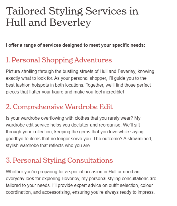
List using highlight colour for subheadings to show the services being offered.
Styled By Urle (N.D.) Personal Stylist-Hull-Beverley. https://urte-personalstylist.co.uk/locations/hull [Accessed 16/12/2024]
The website will also have a contact me box, with a nice setup like the one below, in order to make it simple for clients to ask questions about the service.
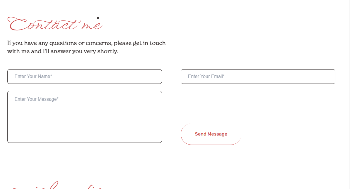
Contact me box feature
Styled By Urle (N.D.) Personal Stylist-Hull-Beverley. https://urte-personalstylist.co.uk/locations/hull [Accessed 16/12/2024]
A couple of quotes from the testimonials section of the website will be displayed on the home page, to give users a feel of the kind of professional and fun service they will receive, as well as a taste of the kind of temperament and energy the stylist/s have, in order to make them feel more comfortable and reassured about booking an appointment with Influent, and let them know they will be in the hands of a professional. The quotes will be in card style, but not as lengthy as the examples below, in order to keep the user’s attention.
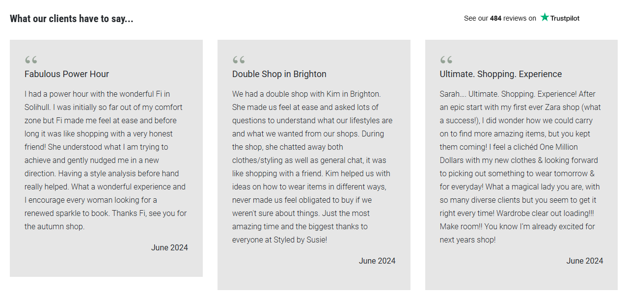
Testimonial examples
Styled By Susie (N.D.) Award Winning Personal Styling/ Styled By Suzie. https://styledbysusie.co.uk/ [Accessed 16/12/2024]
The colours I will use will be a feminine ice cream palette with really light colours, so that the website has personality and colour, without sacrificing on the minimalism.

Ice Cream Palette is soft and subtle
notyetinpieces (N.D.) Ice Cream Pastel Hope Color Palette. Color-Hex. https://www.color-hex.com/color-palette/24111[Accessed 16/12/2024]
The website will also have an easy to use, book-an initial consultation feature at the bottom, to make it easy for clients to book their first appointment with Influent Hull.
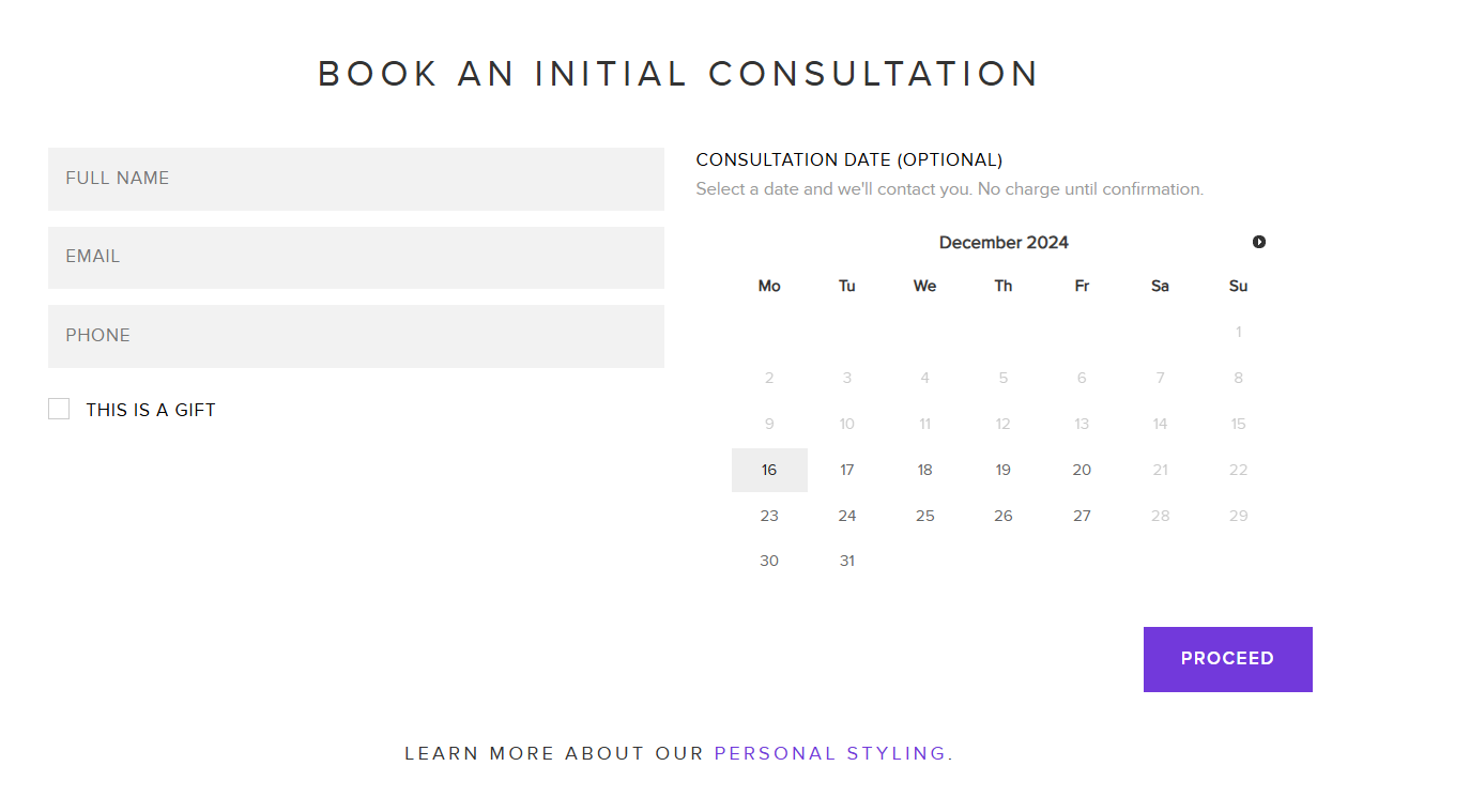
Book a consultation box with gift options, and highlight colour
Daniel Johnson (N.D.) Daniel Johnson Personal Stylist London/ Menswear Specialist. https://www.daniel-johnson.com/ [Accesse 16/12/2024]
Harvard References
Charlotte Loves (N.D.) Personal Stylist, Shopper & Beauty Consultant/ Charlotte Loves. https://www.charlotteloves.co.uk/ [Accessed 16/12/204]
Daniel Johnson (N.D.) Daniel Johnson Personal Stylist London/ Menswear Specialist. https://www.daniel-johnson.com/ [Accesse 16/12/2024]
Ecotricity (2024) Britain’s Greenest Energy Company Ecotricity. https://www.ecotricity.co.uk [Accessed 9/12/2024]
FREENOW (N.D.) FREE NOW-Europe’s Best Taxi App Available In 100+ Cities/ FREENOW. https://www.free-now.com/uk/ [Accessed 12/12/2024]
GoodEnergy (2024) Renewable Energy Supplier Renewable Energy UK. https://www.goodenergy.co.uk [Accessed 9/12/2024]
100Green (2024) 100Green UK’S Only 100% Green Gas & Electricity Supplier. https://www.greenenergyuk.com [Accessed 9/12/24]
828282 Hull Cars (N.D.) Online Hull Cars. https://hull-cars.com/book-a-taxi/online [Accessed 12/12/2024]
Lilaclover (N.D.) White To Light Purple Color Palette. Color-Hex. https://www.color-hex.com/color-palette/38257 [Accessed 16/12/2024]
Minaflatlandsmo (N.D.) White Mina Color Palette. Color-Hex. https://www.color-hex.com/color-palette/104620 [Accessed 16/12/2024]
Incharaprasad (2023) Hick’s Law: The Psychology Of Decision Making/ By Incharaprasad. https://medium.com/@incharaprasad/hicks-law-the-psychology-of-decision-making-11bb52822a18 [Accessed 12/12/2024]
Styled By Susie (N.D.) Award Winning Personal Styling/ Styled By Suzie. https://styledbysusie.co.uk/ [Accessed 16/12/2024]
Styled By Urle (N.D.) Personal Stylist-Hull-Beverley. https://urte-personalstylist.co.uk/locations/hull [Accessed 16/12/2024]
Uber (N.D.) Earn Money By Driving Or Get A Ride Now Uber United Kingdom. https://www.uber.com/gb/en/ [Accessed 12/12/2024]