Typography has a long history, starting from text being hand painted by scribes in the form of “black letter”, to its future as typefaces used on computers graphic design, newspapers, book,s and advertisements; it has allowed for the filtration of knowledge to the masses, and made information more accessible to society. According to J.M. Wells of Britannica “Typography, the design, or selection, of letter forms to be organised into words and sentences to be disposed in blocks of type as printing upon a page. ” (J.M Wells, Britannica, 2023, Typography, Available Online: https://www.britannica.com/technology/typography, [Accessed 03/11/2023])
Good Typography Example
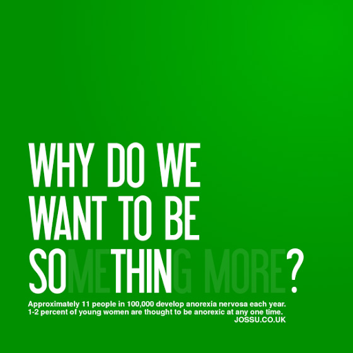
I think this is a good example of typography because of its utilisation of hierarchy when the viewer goes to look at it, and this is achieved through the use of the combination of bold and semi transparent, sans serif text; first the viewer reads the full sentence, before going back and receiving the second meaning of the text. It leads us from “Why do we want to be something more”, to “Why do we want to be so thin”. When looking at this piece, the reader can infer that there is a much deeper meaning to the sentence than on first appearance.
This is followed by the small text at the bottom of the poster which has information about anorexia, and a link to a website also. In this way, the user is pulled in by the colour and text, and can easily, in order, read through the hierarchy of information, to the small text at the bottom.
When looking at this typography it is evident that it has a good use of bold font, and colour to draw in the viewer, and uses two to three words in each line to keep the user engaged on the text as it is very easy and quick to read. It does exactly its purpose, which is to attract user engagement to convey a specific message, and then direct them to a website once engaged. Furthermore, the use of reduced spaces between the letters (kerning), allows the eyes to smoothly read the text, without feeling there are big awkward jumps between letters, adding to the overall punchiness of the typography; this, in addition to small leading space allows the user to read it quickly, which is necessary when the reader has to read the text twice over in order to attain the desired message, as the user could become disinterested very quickly with something that requires a double take.
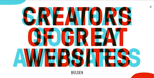
Bad Typography
Reworked

This is my redesign of the original logo prior; I made the decision to remove the colours because, although the idea on the original logo was to create a 3D glasses type colour theme to make the text seem like an optical illusion, it was actually subservient to its purpose of being able to convey information. I felt that it made the text hard to read, and the secondary background text was lost in translation, therefore I decided to do a much more toned down version of this, using a main text in black, and a secondary background text in grey. There is a slight overlap to keep the 3D feel of the logo, but without being unappealing and distracting from the type. I also tried to maintain the feel of the text jumping out at the reader by using the envelope distort, and make with warp tools on illustrator at 20%. I feel it keeps the feeling of a text in motion without being too harsh on the eyes like the first logo.
In the positioning of my typeface, i noticed there was a shape in the negative space around the text, a diagonal line, in which i saw a shape, and realised it looked like the profile silhouette of an open laptop, and i decided to incorporate this into my design to show that the text is coming out of a laptop or an open webpage on the laptop.
I wanted to use ‘Minion Variable Concept’, a serif typeface, to make the logo seem more professional for a web design slogan, as many businesses will employ web designers to create their main websites, so it is important to maintain a feel of professionalism reflected in the slogan.
In future I would like to be able to make better logos, incorporate good use of colour, and have a better understanding of composition.
Harvard References
| Bolden(2022) Bad Design Vs Good Design: 5 Examples We Can Learn From. Available Online: https://www.interaction-design.org/literature/article/bad-design-vs-good-design-5-examples-we-can-learn-frombad-design-vs-good-design-5-examples-we-can-learn-from-130706 [Accessed 07/10/2023] |
| (J.M Wells, Britannica, 2023, Typography, Available Online: https://www.britannica.com/technology/typography, [Accessed 03/11/2023]) |
| Kara Holmstrom (2023) The Importance of Typography. Available Online: https://www.digglescreative.com/blog/importance-of-typography-in-advertising.html [Accessed 07/10/2023] |
| Xoja (2010) Anorexia By Xoja on Deviant Art. Available Online: https://www.deviantart.com/xoja/art/Anorexia-149163506?q=boost%3Apopular+in%3Adigitalart%2Ftypography&qo=9&offset=70#comments [Accessed 07/10/2023] |
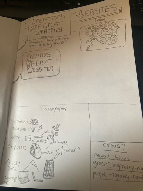
Sketchbook Notes