Older Layout I Chose not to use.
I decided to do two awards for my ‘books’, one for lesser awards ‘innovation at the typewriter’, and another one for a major award ‘carotid artery’. I named the major award carotid artery because it is the artery that carries blood to the brain, and it fell in line with the conceptual theme of my project, which is to celebrate the symbiosis of art, specifically abject horror in books.
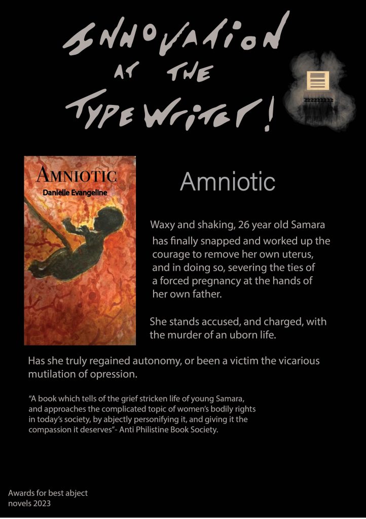
My editorial pages evolved two different styles, but they are both standardised and have corresponding colour schemes of black and white; the first is for the innovation at the typewriter awards, which has plain black banners at the top and bottom of the page, and other standardised accents such as logo placements and slogan typography “ventricle”.
The second style of page follows the same colour scheme, and use of logo and slogan typography, however I used to casted shadows that came along with my hand drawn typography. I separated the typography from these shadows once they were vectorised, and used these as the banners because I think that it had some really awesome looking shapes, and added texture to the carotid artery page, and also to the transgressions in art explanations.
Prior to these pages, I had attempted to create a layout for the innovation at the typewriter book awards, but I disliked the look of having a block colour in the background, it made it look like a bad website/blog from the early 2000’s, and so I had to start again from scratch. I am proud of what I came up with, and also changed the aspect ratio from A4 to a website canvas, which looked more professional.
The blog has three pages for innovation at the typewriter, and one major award page, ‘carotid artery’, followed by two informative pages which explain my motive, concept, and the definition of what i have chosen as my topic ‘abject art’ as a propellant for human social-development. However, I think that because wordpress only allows embedded images to go a certain size, it could be a little hard to read the text on my editorial pages, which is a worry. In addition to this, I chose a medium quality to export these pages so they would fit on the wordpress site, and I worry this has degraded the quality of text also. I feel the pages would be more appropriate as an actual website so that the text and layout can be seen and read in the way it was intended.
Overall I am very pleased with my work, and I think it has a clear and concise colour scheme (black, white, and grey),, as well as standardised features that prevail throughout, (the logo, and typography standards). The typography works well together, and, if not on wordpress, would be much more easy to read in a website setting. I would like to resolve this issue in future so that my work is more legible on wordpress. In addition, I also think that the transgressions in art pages are very informative, and have quotes and references from interesting artists who align with my project values. All Harvard references can be found on this page.
Harvard References
| Burgess,A. (2000) A Clockwork Orange, London: Penguin Books Ltd. |
| Küster, U. (2011) Louise Bourgeois, Ulf Küster, Ostfildern,Hatje Cantz Verlag. |
| Lesso,R. (2023) The Collector, Why Did Tracy Emin’s Bed Cause Such A Sensation? [Blog Post] 3 January, Available Online: https://www.thecollector.com/why-did-tracey-emins-bed-cause-such-a-sensation/ [Accessed 19/12/2023] |
| Murakami,R. (2006) In The Miso Soup, London, Bloomsbury Publishing Plc. |