Here are my typographical standards for my Development Blog for Ventricle.
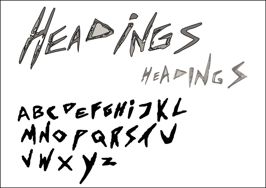
In the first box I have included some hand drawn alphabets, lowercase and uppercase, in my own font that I use when I am drawing. I decided that it would be perfect for this assignment because it is quite a sharp and gritty looking font, which is the aesthetic which I wanted for my horror book blog. I drew them in pencil, and took a photograph of the alphabets, which I uploaded in illustrator and used trace image, and create outlines, to make them vectors. I then recoloured the lower case alphabet to make it a bit more uniform, but left upper case as I liked the different shades on the letters, and the texture it creates.
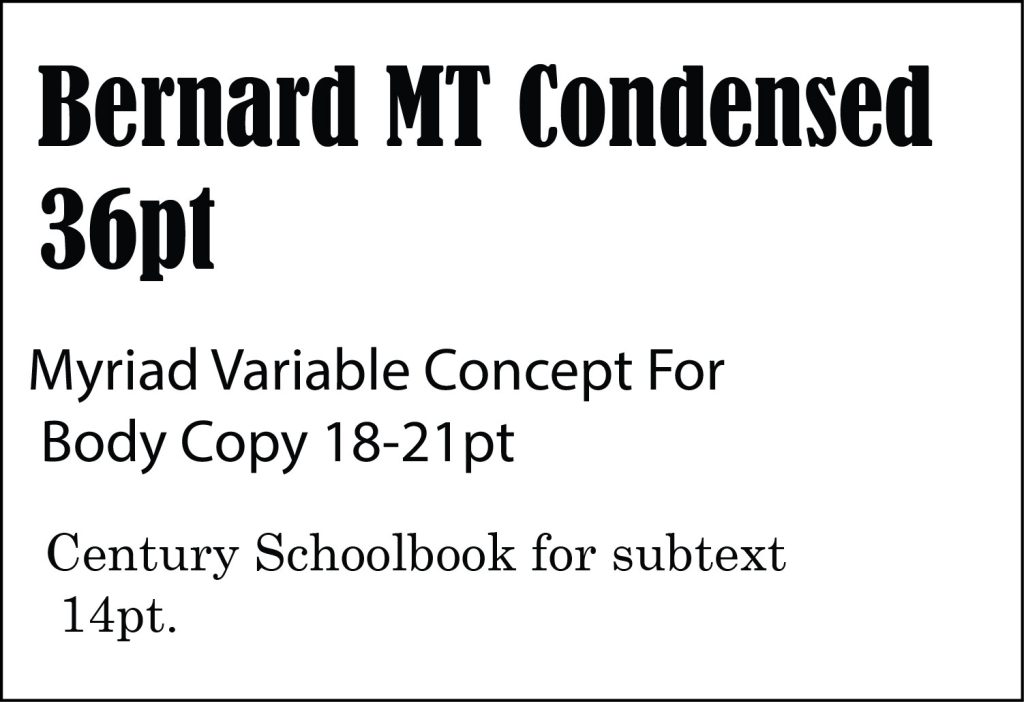
The typography I chose is Bernard MT Condensed at 36 pt for subheadings, because it stands out and is very bold, and therefore when paired with my other typographical choices, it creates hierarchy on my website, and can be used to draw attention to certain topics, for example the type of award category for the books i am using, or the winning book titles.
For body copy I chose Myriad Variable Concept at 18-21 pt. I decided to give a size range on this one as sometimes if there is a lot of text on the web page, the body copy will need to be 18pt rather than 21pt, as it needs to fit on the page and still be readable. I also felt that this font looks nice against Bernard MT Condensed and Century Schoolbook, but it is still distinguishable, and adds to the hierarchy/importance of information in my blog.
Finally, for subtext, i chose Century Schoolbook at 14pt, and i chose a serif font because it looks a little more formal than the other two fonts, and therefore can be used for this such as subtext, and notes underneath pictures to show who “wrote” the books winning the awards, and also for things such as added information on a topic, or at the bottom of the page, underneath body copy, and this, again, adds to the trickle of information in levels of importance. I also think that it looks nice with the other font choices and is easy to read even though it is being used at 14pt.
Finally the last section of my typographical standards includes my colour theme swatches, which are black, white, and light grey. I chose these colours because they represent the colour themes of yin and yang, which aligns with the conceptual theme of my logo and blog. I allowed for the grey because it is used in the shading of my logo and could be used for things such as typography colour for quotes, and maybe banners and icons, if the standards were to be used long term.
The black and white together is an obvious choice, and a classic colour combination that looks really clean together, and also allows for typography to be readable; the tonal colours are also appropriate as the blog is for horror book reviews, and i think if i had used lots of bright colours, it would not have fit with the conceptual theme of my work.
Overall I think that these typographical standards work well, and when used together with one another, should create a brand and style which stays standardised, the typography, logo, and corresponding colour swatches, all pertain to my blog and “Ventricle” brand.
I found the process of finding typography to compliment each other quite tedious and difficult, as most of the fonts look deeply unattractive when put next to one another, so the fonts and pt sizes are the fonts and sizes i think look good together along side my hand drawn font. It took me a couple of times to redo this typography box till I got some fonts that I felt looked good together.