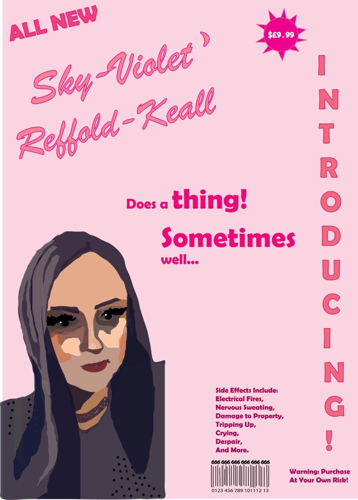
With this promotional poster, I wanted to show my most important and favourite aspect of my personality, that is,my sense of humour. I created a poster which mimics those pamphlets that get posted through your door against your will, advertisements for things you’ll maybe never use, or for food shops. In this sense, I wanted to become the product, and I also thought it would be a good way to exhibit my use of composition, typographical hierarchy, and use of good colour. I have very dry, ironic humour, and so I wanted to show that with this poster.
I turned the “introducing” typography horizontal along the side as though it’s for a cheap leaflet or pamphlet trying to get your attention for this “product” that’s being sold. I also wanted to convey a sense of irony towards the packaging of things such as toys or dolls in a new shiny box, but of course it’s just me being advertised.
The text has a hierarchy of bigger text to smaller text, and with a couple of different types of pink colours which go together very well, which leads the viewer to read from either top left and down, or from side right, then up, and down to the bottom, depending on which of the two grabs the reader’s attention first, either “introducing”, or “all new”.
At the bottom I also wanted to put a barcode, juxtaposing my human life, nihilistically, with that of a plastic doll, or an object trying to be sold; there is also a price tag in the top hand corner. I changed the usual bright yellow of price stickers, to a bright pink, to match the colour scheme of the poster. I also used a dollar sign because I feel like this type of thing makes you think of a big yellow sticker with a dollar sign on it, advertising something silly. Though it is played out, i think the pink colour scheme recycles an old concept into something new that represents me and my personality.
With this promotional poster, I wanted to show my most important and favourite aspect of my personality, that is,my sense of humour. I created a poster which mimics those pamphlets that get posted through your door against your will, advertisements for things you’ll maybe never use, or for food shops. In this sense, I wanted to become the product, and I also thought it would be a good way to exhibit my use of composition, typographical hierarchy, and use of good colour. I have very dry, ironic humour, and so I wanted to show that with this poster.
I turned the “introducing” typography horizontal along the side as though it’s for a cheap leaflet or pamphlet trying to get your attention for this “product” that’s being sold. I also wanted to convey a sense of irony towards the packaging of things such as toys or dolls in a new shiny box, but of course it’s just me being advertised.
The text has a hierarchy of bigger text to smaller text, and with a couple of different types of pink colours which go together very well, which leads the viewer to read from either top left and down, or from side right, then up, and down to the bottom, depending on which of the two grabs the reader’s attention first, either “introducing”, or “all new”.
At the bottom I also wanted to put a barcode, juxtaposing my human life, nihilistically, with that of a plastic doll, or an object trying to be sold; there is also a price tag in the top hand corner. I changed the usual bright yellow of price stickers, to a bright pink, to match the colour scheme of the poster. I also used a dollar sign because i feel like this type of thing makes you think of a big yellow sticker with a dollar sign on it, advertising something cheap. Though it is played out, I think the pink colour scheme recycles an old concept into something new that represents me and my personality.