eDecks Live Design Group Project
In this assignment we were assigned groups from the class, which were then paired with groups from the business school, and our task was to meet with the company eDecks to re-design several different facets of their brand, to help increase the gap in winter sales, including their website and social media videos,as well as physical visuals such as van design, billboards, and posters;
I will be discussing several aspects of this assignment, including the subject, audience and purpose of the design materials, in addition to relevant design history and inspirations, the project’s development over time, and examples of our teamwork. Due to the nature of the assignment, I will also be discussing some of the shortcomings we experienced and what we learned from this design challenge.
Subject, Audience, Purpose
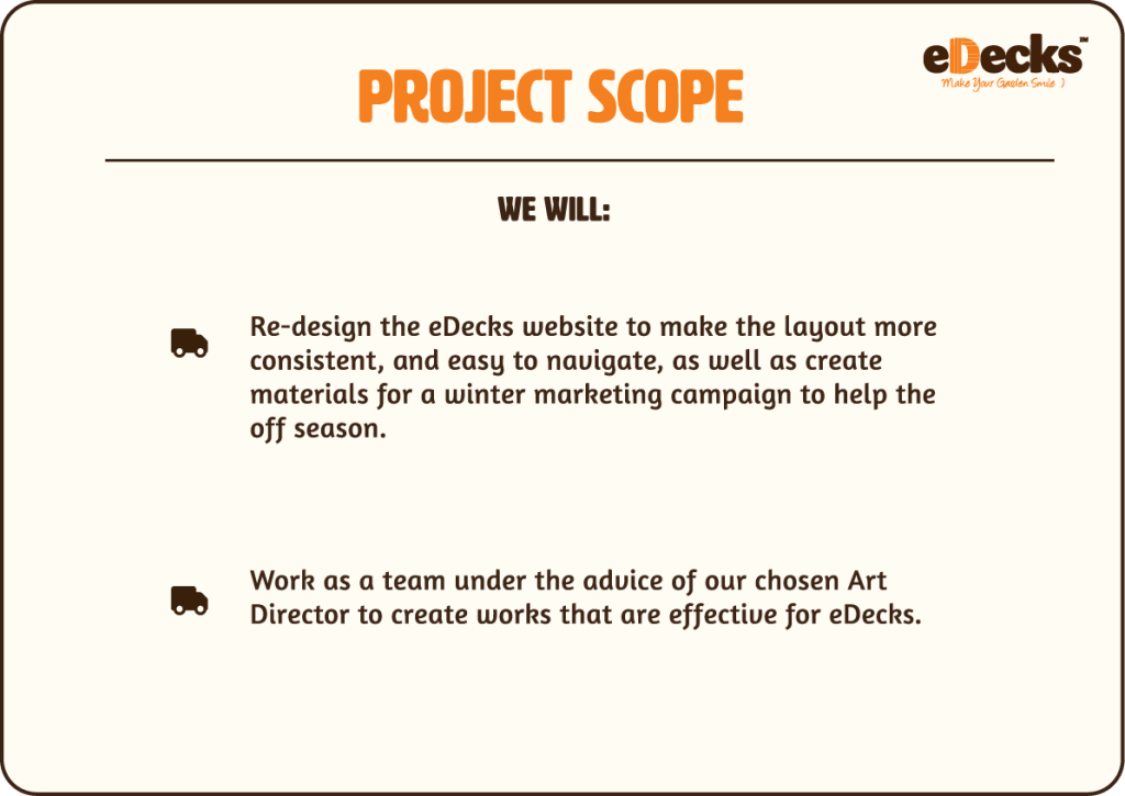
The subject of our group’s task was to redesign the eDecks website, which would include banner advertisements and offers on their homepage, the hero layout and button organisation, and the utilization of colour as a call to action element through hierarchy, as well as some other advertisements in the form of posters and videos for social media, at the request of the business group; However some of these were not fulfilled such as the videos due to the incongruent relationship and work ethic of the business group, whereby we were asked to create materials which where not achievable, or with incomplete marketing ideas that didn’t pertain to the winter sales goal, and with little to no notice.
The brief states that the audience for this project are homeowners and first time home buyers, from the ages of 28 upwards, however according to Mojo Mortgages through the analysis of their internal datastating “The national average age of a first-time buyer in the UK is 33 years, 8 months.” (Aidan Darrall (2024) Mojo). Other target audiences include hobbyists, gardeners, builders and tradespeople, as well as small scale landscapers.
In terms of audience and how their budget is likely to dictate purchasing decisions, Mojo also states that “This milestone age reflects the increasing difficulties young adults face in saving for a home. Furthermore, a recent report by Lloyds Banking revealed that in 2023, the average deposit for first-time buyers was a hefty £53,414, with the average mortgage amounting to £234,722.” Which means that the eDecks marketing campaign and website’s unique point of sale will need to focus on the reasonable pricing they can offer across all of their customer base.
The purpose of this design brief is to redesign the Edecks website homepage layout, so that it is more accessible (easier to read, and navigate), through the organisation of content such as buttons, and how product categories are organised, as well as better banner advertisements to highlight potential offers on products, and the use of colour to establish a visual hierarchy, as well as to highlight key features without being overwhelming and confusing; Also in doing so, applying Jajob’s Design Law, with an NN Group article stating
“Jakob’s Law of the Web User Experience states that “users spend most of their time on other websites.”
This means that they form their expectations for your site based on what’s commonly done on most other sites. If you deviate, your site will be harder to use and users will leave.” (Jakob Nielsen (2011) NN Group)
All of which is important because the goal of the redesign is to get homeowners to want to purchase products from the website, and in order to do so, they need to be able to comfortably and confidently navigate the website, to find what they came for, and with the best case scenario of them purchasing something they didn’t come for, through the use of offers and advertising visuals. According to Laws of UX about Hick’s Law:
“the more stimuli to choose from, the longer it takes the user to make a decision on which one to interact with. Users bombarded with choices have to take time to interpret and decide, giving them work they don’t want.” (LawsofUX (N.D.) Hick’s Law Laws of UX)
Following Hick’s Law can prevent users from being overwhelmed with options, and immediately leaving the website before they have even begun browsing.
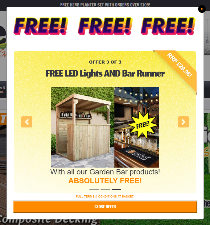
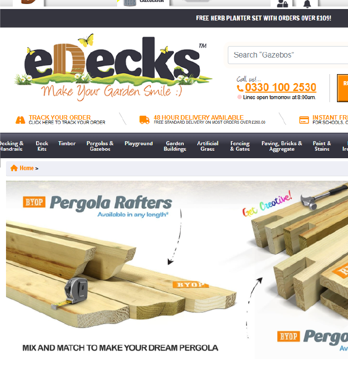
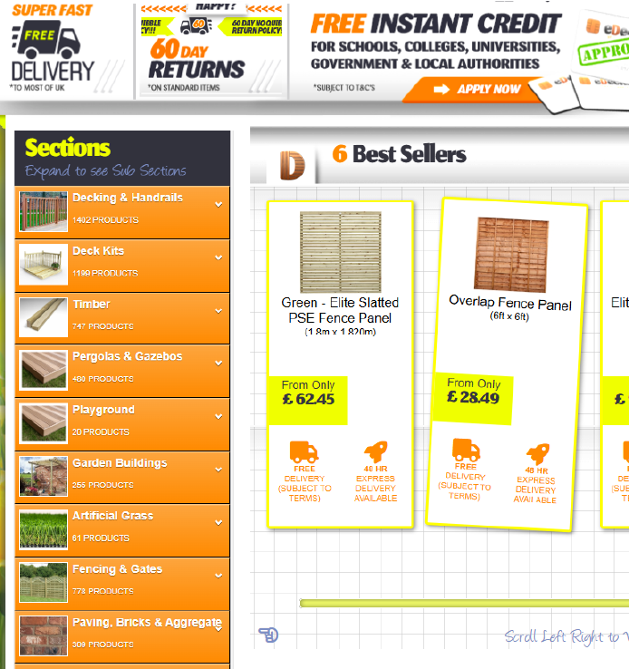
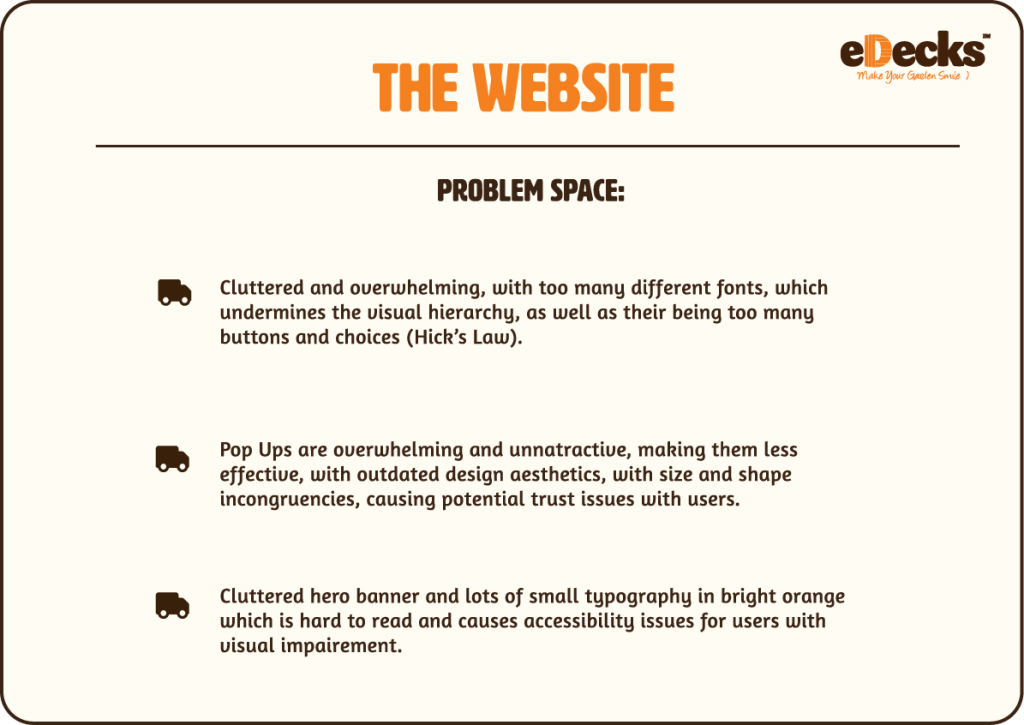
Pop Ups, Light Coloured Small Text, Cluttered Hero, and Too Many Buttons
eDecks (N.D.) Decking & Timber Supplies Home and Garden DIY edecks.
Relevant Design History
When we looked at our competitor research, we found certain features that we wanted to incorporate into the eDecks website to give it an established hierarchy, ”The page’s visual hierarchy controls the delivery of information from the system to the end user — it lets users know where to focus their attention.”; (Kelley Gordon 2021)
We also aimed to declutter some of the buttons in line with Fitt’s Law, to make it more quicker for users to navigate, “Make sure that touch targets (such as buttons and menu items) are large enough for users to select them with ease, and that they’re positioned in a convenient, easily accessible location on the screen.” (Emily Stevens.2024)
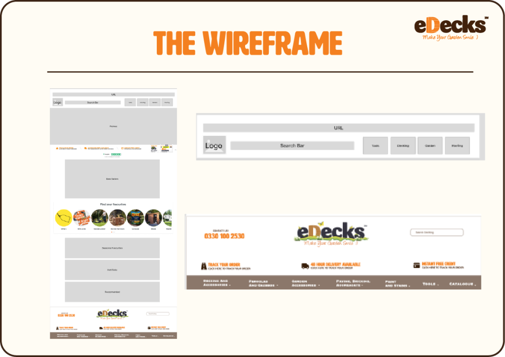
. I will also be discussing some inspirations for improved social media poster designs, as well as physical marketing such as billboards. It can be observed below the final wireframe layout we chose for the website; I will be discussing the reasoning behind our design choices below.
Wickes
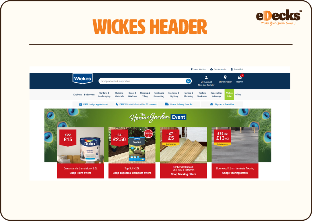
When looking at the header design of the Wickes website, it can be observed that it is much easier to navigate and is less cluttered, as well as having their delivery offers, (“click and collect”, “home delivery”) , placed beneath the top section, which makes the site feel more spacious, and re-establishes a visual hierarchy. We incorporated this into our wireframe design for eDecks to help alleviate some of its spacing issues, helping with incorporating Hick’s Law.
In addition to this, we kept the hero banner image in the same place, keeping true to some of the eDecks original design, as it is a well recognised UI feature and adheres to Jakob’s Law; as well as being used to drawing attention to relevant offers.
In designing this wireframe, it was decided that we would reduce the number of buttons,, making searching for items more streamlined and less confusing and overwhelming, therefore we placed everything into four main buttons which users could access quickly: “Tools”, “Decking”, “Garden”, and “Roofing”, (Hick’s Law and Fitt’s Law), which could then branch off into more specific categories on a different catalogue page of the website. Arguably, this looks much more effective than having an exhaustive list of buttons, providing an overwhelming UI/UX.
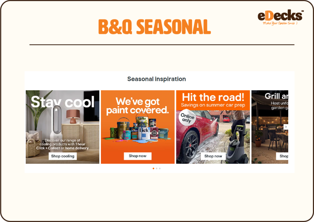
B&Q
Another competitor that we looked at for the website redesign was B&Q. When looking at the wireframe, you can see that we incorporated their “find your favourites” scrolling banner feature, which allows users to scroll through commonly searched items; this could be particularly helpful in applying Fitt’s Law, and reducing the time is takes for users to navigate to where they want to go on the website, by compiling the most commonly accessed categories on the website, and therefore reducing user’s time searching the website for what they need, (Fitt’s Law). e-Decks does have a section for best sellers but it only incorporates specific features of fencing, and disregards other popular categories on the website such as decking.
In addition to this, another feature we incorporated includes a section for “seasonal offers”, which directly applies to the live design brief, by helping to increase sales during the off-season by suggesting winter relevant products such as hot tub gazebos and pergolas. Also, this feature be changed each season, allowing for the home page to be more tailored on the client, (server), end too.
Robert Dyas
Inspirations for marketing components such as heroes showing discounts and deals includes the Robert Dyas website, which uses bright colour, and shape to establish a visual hierarchy, as well as using scale and shape to uniformly attract the eye to the banners information.
NN group states on scale “The principle of scale is key in creating visual hierarchy in a design. Bigger elements stand out more and attract users’ attention, so size can be used as a marker for importance.” (Kelley Gordon. 2021)
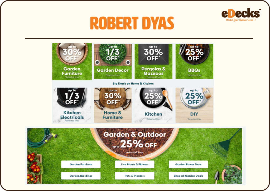
This can be used across all marketing media, both physical and online, to attract users attention, and create designs which adhere to the Aesthetic-Usability Effect and are therefore more likely to pay attention: “The Aesthetic-Usability Effect states that users tend to perceive aesthetically pleasing designs as more usable.” (Emily Stevens 2024)
Project Development
The first part of our project development included all four of us sitting together, (after seeing a powerpoint on the assignment brief), and starting a figjam board to collate all of our ideas together on the eDecks website, from UI/UX to colour and typography. We placed these ideas together and organised these problem spaces into sections, and through competitor research, we started to take screenshots of features we thought were good UI/UX to potentially incorporate into the redesign.
Below I will embed the figjam link so that our rough research can be explored. Following this we were assigned our Art Director, James, who was to help oversee and improve our design process going forward on this project.
Type, Colour, Logo And Mockups
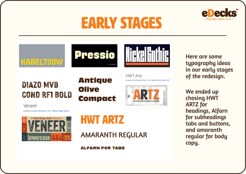
Following this, we started to gather together typography ideas, and discussed which fonts we thought best and why. In the end we ended up choosing HWT Artz for main headings as it is bold and easy to read. I thought that Alfarn could be used for subheadings as it is also bold but doesn’t conflict with HWT Artz, and Amaranth Regular for a readable body copy.
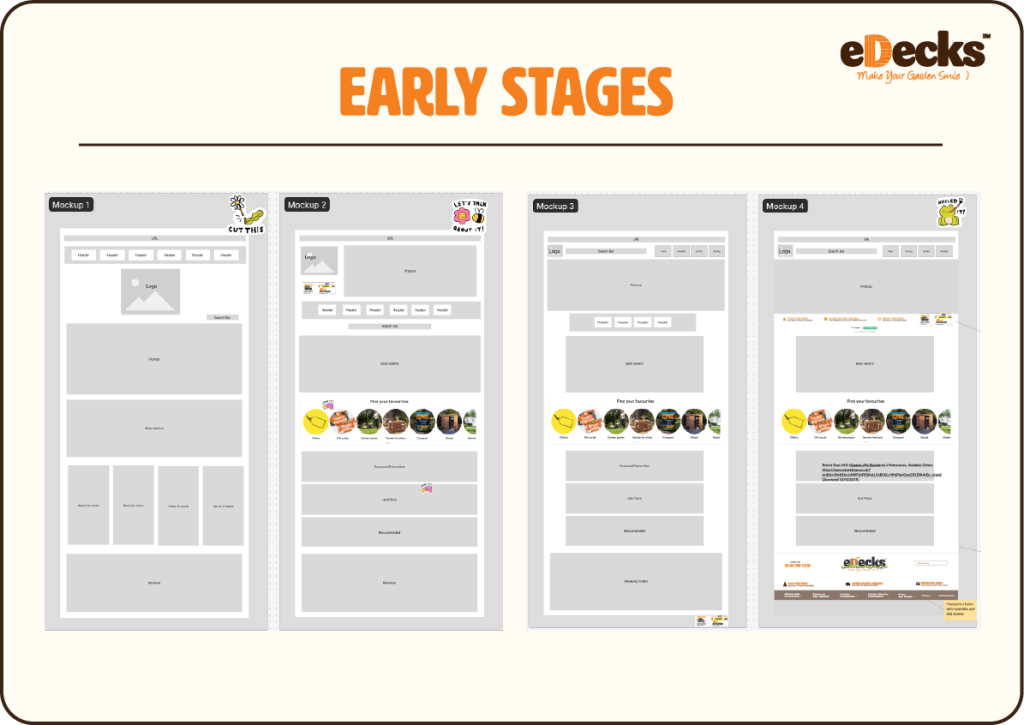
After this, Jess looked at the information we had gathered from competitor websites, and put together a selection of mockups which incorporated some of those features, which can be seen above. We then had our art director sit with us and give us advice on which wireframes looked the best, allowing us to pick one to take forward.
Logo
I also designed a more simplified typographical logo for eDecks to be used alongside our rebranding for the website.
Colour
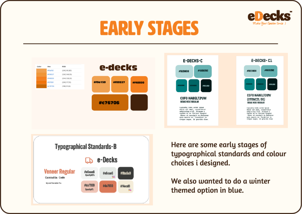
During the process i also created some different ideas for the colour schemes we could use for the project, using the font options we had collated; Jess had suggested we do one color scheme in a winter theme because of the design brief, and so i put together a blue version of our typographical standards; however we ended up keeping the orange colours because we didn’t want to stray completely from the original branding of the website.
Marketing Students
We then met with the marketing students to be assigned our groups that we were going to work with. We soon found that our group was uncooperative and didn’t speak to us for the majority of our time there, which left us with questions on how we were going to complete this task as graphic designers, whilst experiencing communication problems.
This did continue throughout the whole of the project, which gave us a professional challenge, both in learning how to maintain a difficult relationship with the client, as well as how to assert healthy boundaries that respected our time as graphic designers; for example, we were asked to create works based on vague subject briefs which required us to do the most of the legwork.,
Despite being in a negative relationship, we felt that it was invaluable experience in dealing with a difficult client, and allowed us to experience a dynamic that we may well have to experience in the field as graphic designers. In dealing with this, i feel we learned some of the signs to look out for when taking on clients, signs such as:
Although this all seems negative, we felt that this was a very good experience at navigating such a client and dynamic, and gave us space to think about what boundaries we should take forward with us into the industry, to protect our time and mental health, and showed that we were resilient, worked together as our glass group.
Team Work
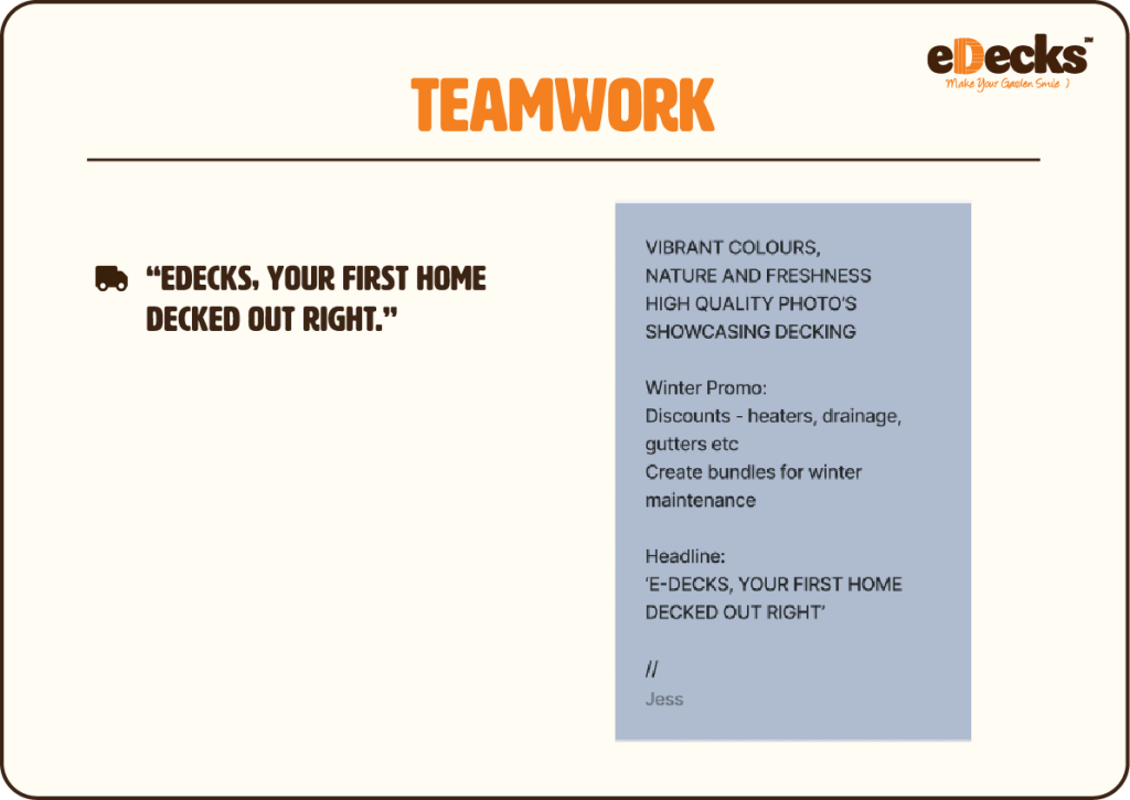
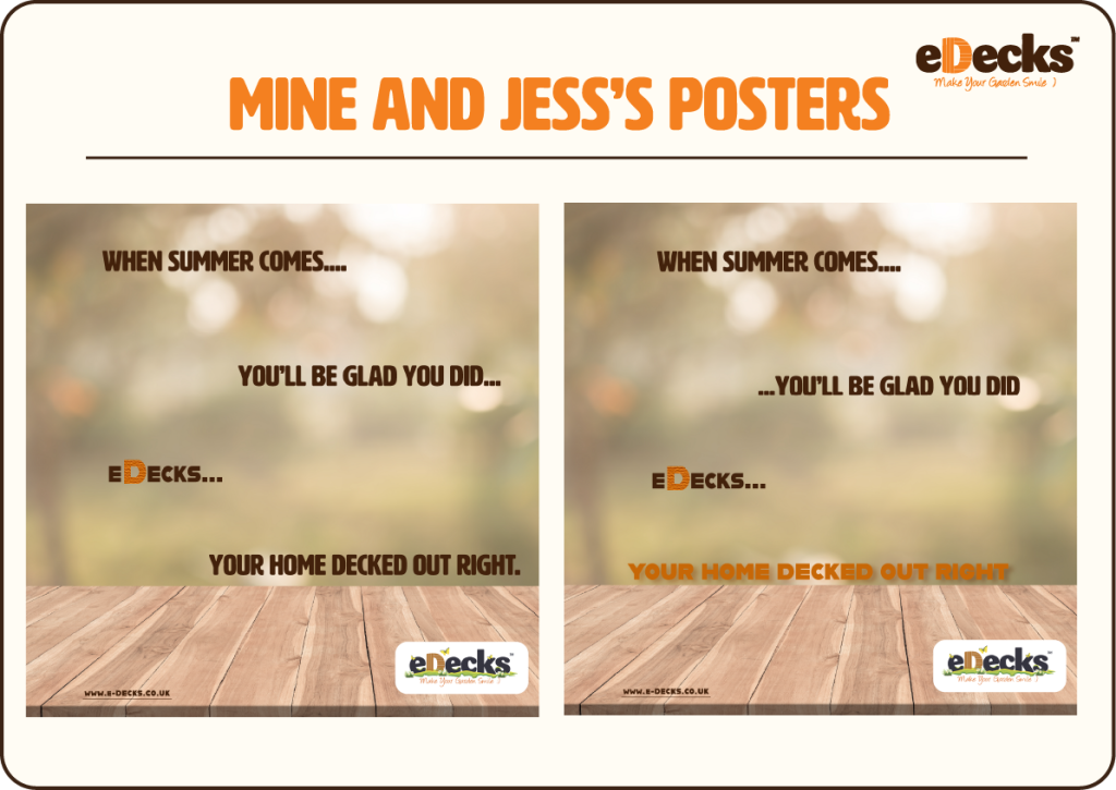
We were given some design briefs from the marketing students on what they wanted us to create which can be seen below; they wanted us to incorporate the slogan “eDecks. Your home decked out right ”, with fresh and naturistic themes, as well as winter product bundles, however we struggled to find any winter products on the website to advertise at all.
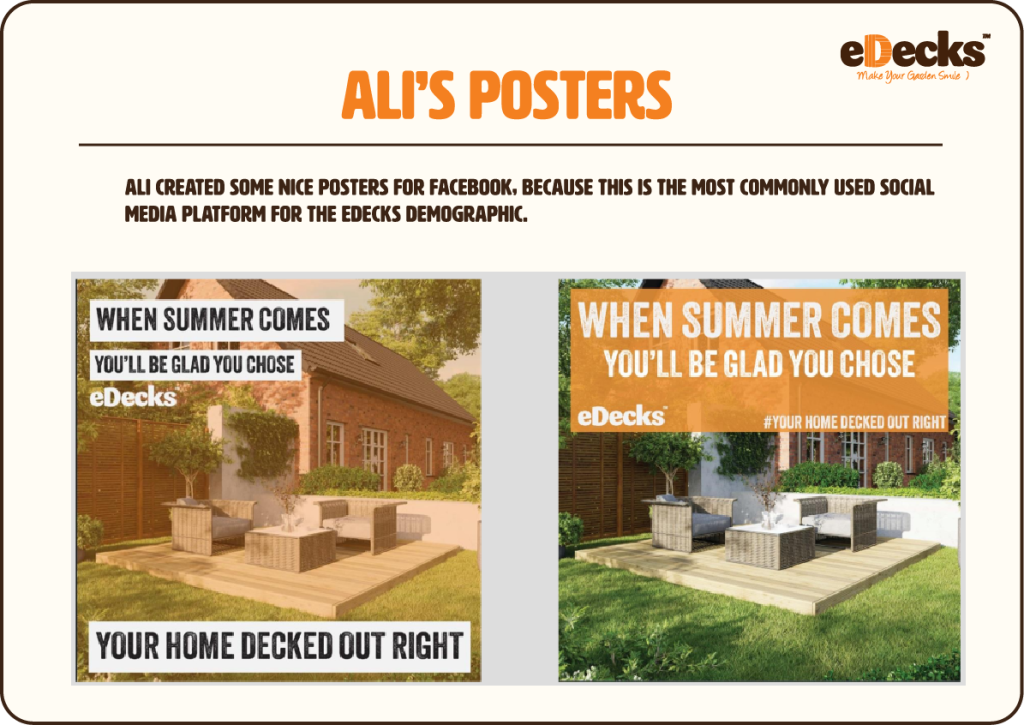
Our Social Media Posters
In response to this Ali completed some social media posters for facebook and instagram, and me and Jess collaborated on an instagram poster together, which was very useful, as I found having an extra pair of eyes really helped in correcting things that weren’t establishing hierarchy, and it was useful to receive constructive criticism.

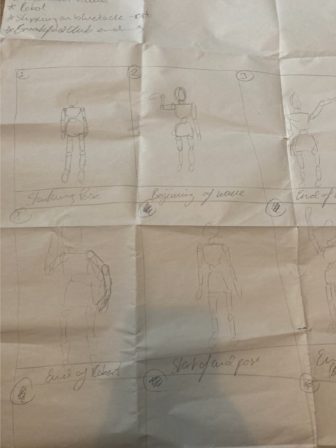
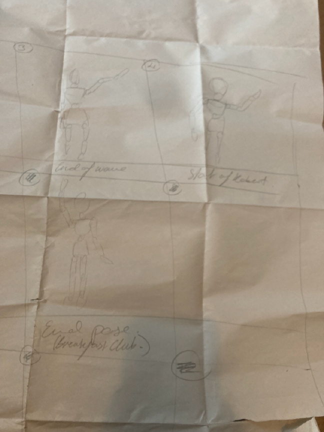
Rob's Psychometric Test
During one of our lessons, we did a psychometric test which allowed us to work in groups, and be given a role based on our test answers. I answered that I felt I didn’t relate to any of the question options and so I was considered neutral and paired with Jess and Callum, and we were asked to create a short stop motion video using a wooden figurine together. I did end up partaking in the leadership role, with my idea being picked for the video, which was to make the figurine dance. In this task, I felt that I learned something about myself, which is that I am afraid to initially take charge, but I am fully competent in a leadership role, which is something to consider for my future as a graphic designer.
Stop Motion Storyboard
Our Roles In The Group
Jess’s role was as the group leader, and she was excellent at listening to our ideas, and communicating them forth with one of the groups we had, and Ali communicated with the second group. In addition to this, she also set up several physical meetings with the groups to try to collaborate on campaign ideas, but the other students didn’t understand their own brief and there was little turnout despite my team’s best efforts.
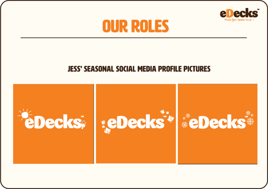
Jess also created some seasonal social media profile pictures to help improve visibility and establish strong branding; we had decided at this point that the best solution to the brief was to help increase sales for the rest of the year, to bridge the winter gap, as the problem lies not with the marketing, but with the fact that eDecks has little to no winter appropriate stock to sell to begin with.
Ali’s role was to communicate with the secondary group, in order to create clear communication between all of us, as this was vital due to us being assigned two different marketing groups, and we needed a way to bring these ideas together.
During the project, my role included taking charge of the branding for our eDecks designs, as well as designing the website’s redesigned assets. I also designed the typographical standards, in which I picked two fonts which paired well together to re-establish a graphical hierarchy, I chose and refined the colour scheme, as well as creating a fresh logo redesign to fit the rest of the branding. I also designed the website homepage, which includes a sliding advert banner which improves the original advert layouts.
Final Video
Harvard References
Aidan Darrall (2024) Average Age of First-Time Buyer in the UK. Mojo Mortgages. Available Online: https://mojomortgages.com/first-time-buyer-mortgages/average-age-of-a-first-time-buyer-uk [Accessed 27/04/2025]
B&Q (N.D.) DIY Products at Everyday Prices. Available Online: https://www.diy.com/ [Accessed 29/04/2025]
Dwtardis (N.D.) 6 Shades of Orange Colour Palette. Color-Hex. Available Online: https://www.color-hex.com/color-palette/4914 [Accessed 19/03/2025]
eDecks (N.D.) Decking & Timber Supplies Home and Garden DIY edecks. eDecks. Available Online:https://www.edecks.co.uk/home [Accessed 28/04/2025]
Emily Stevens (2024) What are the laws of UX? All 21 laws explained. UX Design Institute. Available Online: https://www.uxdesigninstitute.com/blog/laws-of-ux/ [Accessed 29/04/2025]
Jakob Nielsen (2011) Top 10 Mistakes in Web Design. NN Group. Available Online: https://www.nngroup.com/articles/top-10-mistakes-web-design/ [Accessed 27/04/2025]
Kelley Gordon (2021) Visual Hierarchy in UX: Definition. NN Group. Available Online: https://www.nngroup.com/articles/visual-hierarchy-ux-definition/ [Accessed 29/04/2025]
LawsofUX (N.D.) Hick’s Law Laws of UX. Available Online: https://lawsofux.com/hicks-law/ [Accessed 27/04/2025]
Marysno (N.D.) Muted Orange Color Palette. Color-Hex. Available Online: https://www.color-hex.com/color-palette/31719 [Accessed 19/03/2025]
Rachele2113 (N.D.) Shades of Teal Color Palette. Color-Hex. Available Online: https://www.color-hex.com/color-palette/4666 [Accessed 20/03/2025]
Robert Dyas (N.D.) Robert Dyas Garden, DIY, Electricals, & Homewares. Robert Dyas. Available Online: https://www.robertdyas.co.uk/?srsltid=AfmBOop4ZzUI_iSbWrOH4attiY1c8SUyWROfWi4sUkXkf0egDS8lO0Cy [Accessed 29/04/2025]
Wickes (N.D.) Wickes DIY & Trade Home Improvement Products and Inspiration. Wickes. Available Online: https://www.wickes.co.uk/ [Accessed 29/04/2025]