Conceptual Design Idea And Research
In this assignment, I will be creating an animation that creates an established brand for an energy drink for people of 60 and above, as well as implementing Tufte’s design principles to create an animation that conveys information that people can process and understand easily.
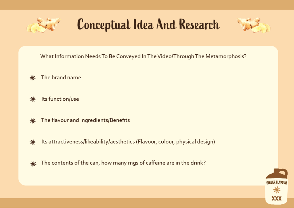
My first ideas for conceptual design where; Could it be a metaphor for a physical state? One state into another? Tired into energized? Which followed into thoughts of; What branding should the drink have/ what semantic visual language should be used? What is the product’s unique selling point?
After doing some competitor research and creating a Figjam board of ideas, and looking at user research, which was very limited due to energy drinks not being particularly healthy, especially for people over 60, i found a comment from an older lady as follows:
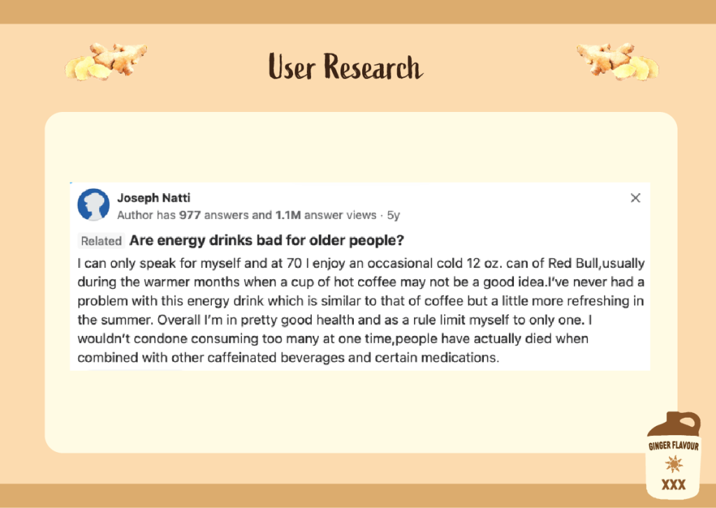
Joseph Natti (N.D.) What is an energy drink for women above 50 years old? Qurora.
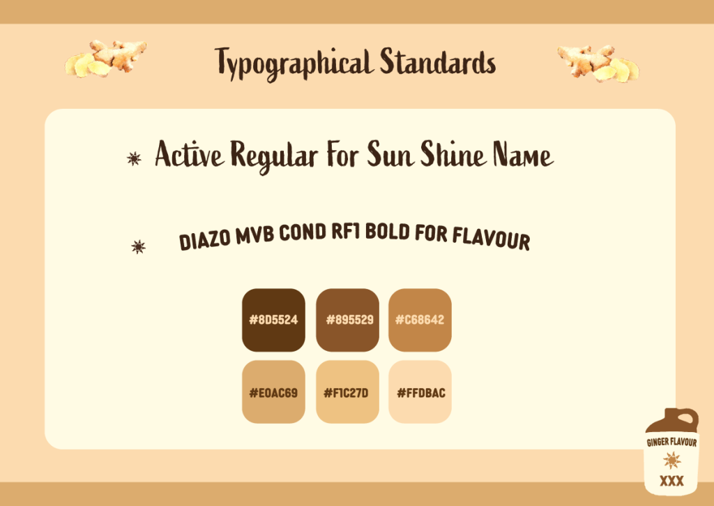
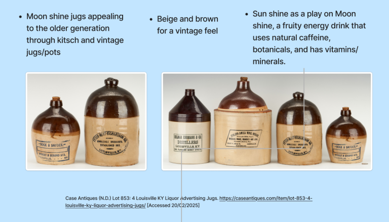
Therefore I decided to go with a similar ginger flavour like red bull has in order to create comfortability through familiarity with my brand for its demographic. I also decided to go with a pun “Sun Shine” which is a play on words using “Moon Shine”, which would allow me to use a ceramic jug as the logo which I think is a visual that resonates with the older generation, and is tongue in cheek.
Its function and use is to be a replacement for coffee during the hotter months for over 60’s.
The aesthetics include a colour scheme used for MoonShine ceramic jugs, coffee style browns and creams, combined with a ginger tone to represent the flavour.
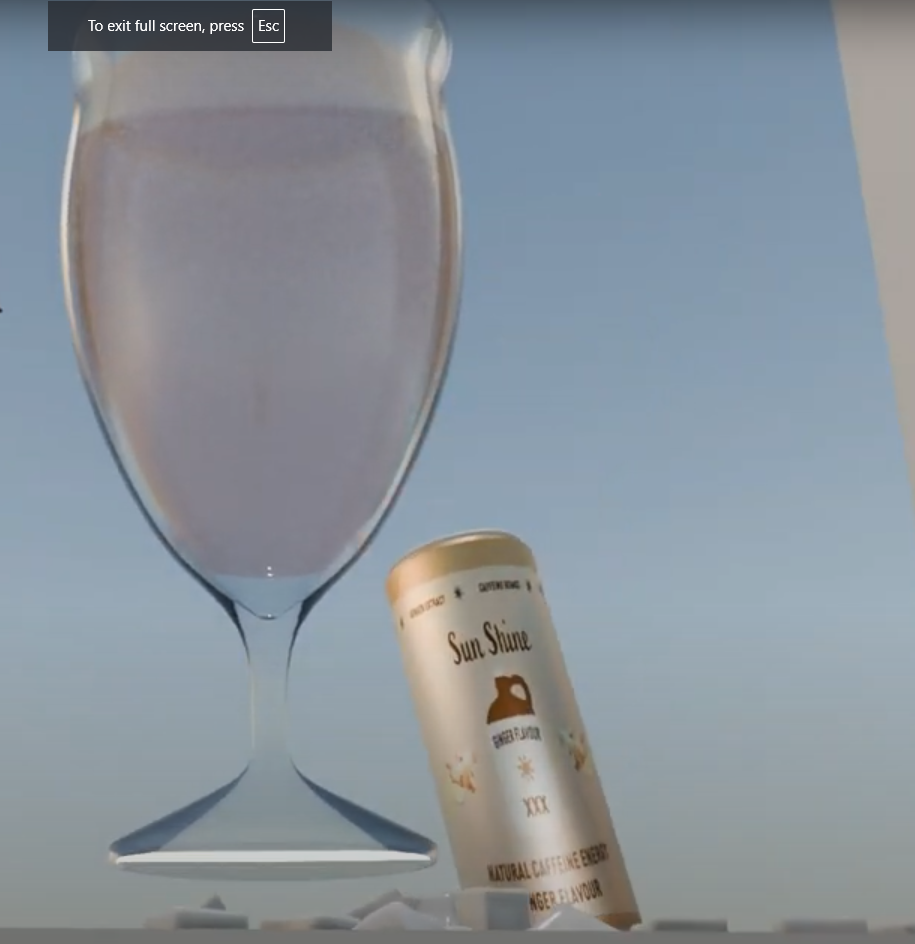
My research for my metamorphosis came from youtube video tutorials, and several failed storyboards which I made, and ideas I had which I did not have the skillset to execute, of which will be discussed in detail next. My final idea was to create a scene where the camera does a 360 view of the drinks can, traveling underneath the ice cubes beneath it, and coming back around to reveal a drink in a glass.
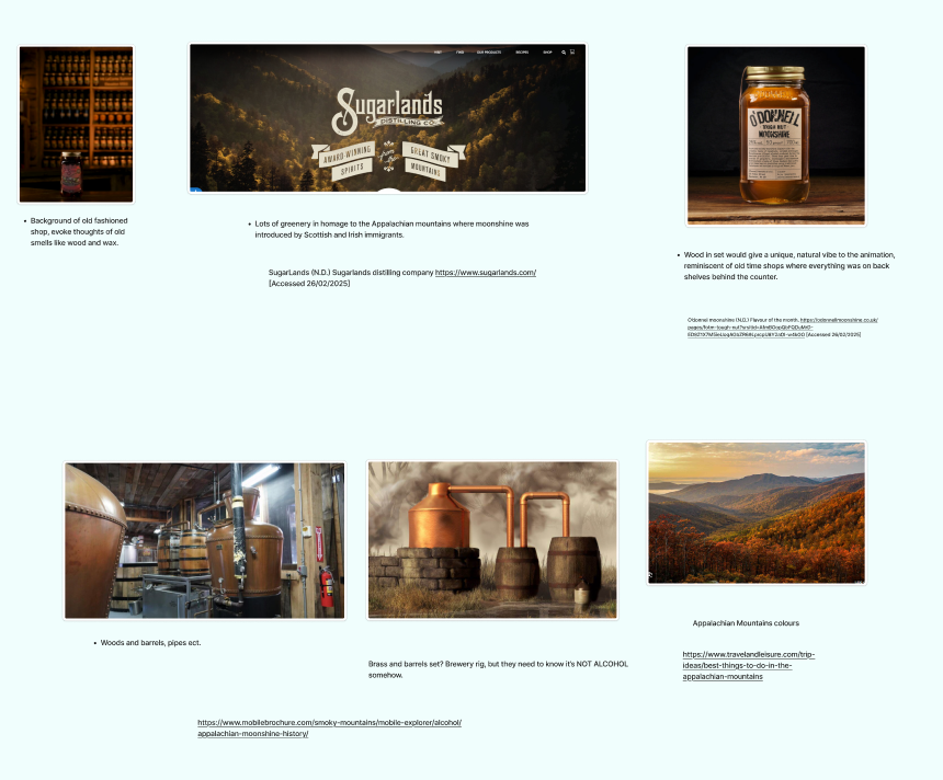
I did some competitor product research also on the Figjam board, and found some MoonShine companies who had aesthetics that paid homage to the Appalachian mountains, where it was introduced by Irish and Scottish immigrants:
“Brought to America in the 18th century primarily by Irish and Scottish immigrants, moonshine was often homemade, and is often associated with Southern culture.” (Ozark Moonshine Fest Website. 2023-2025)
This use of colour was connotative of copper pipes, aged wood and stone, and lots of warm brown tones, which helped me develop the colour scheme for my drink.
Competitor research for natural energy drinks
Looking at Moon Shine companies and their branding, as well as colours and textures associated with Moon Shine’s history
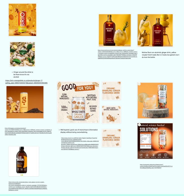
Looking at colour and aesthetics for ginger drinks
Looking at Moon Shine jugs for colour and aesthetic inspiration
Competitor Research Figjam Board With Notes
Animation Storyboards
Idea One- The Egg Machine
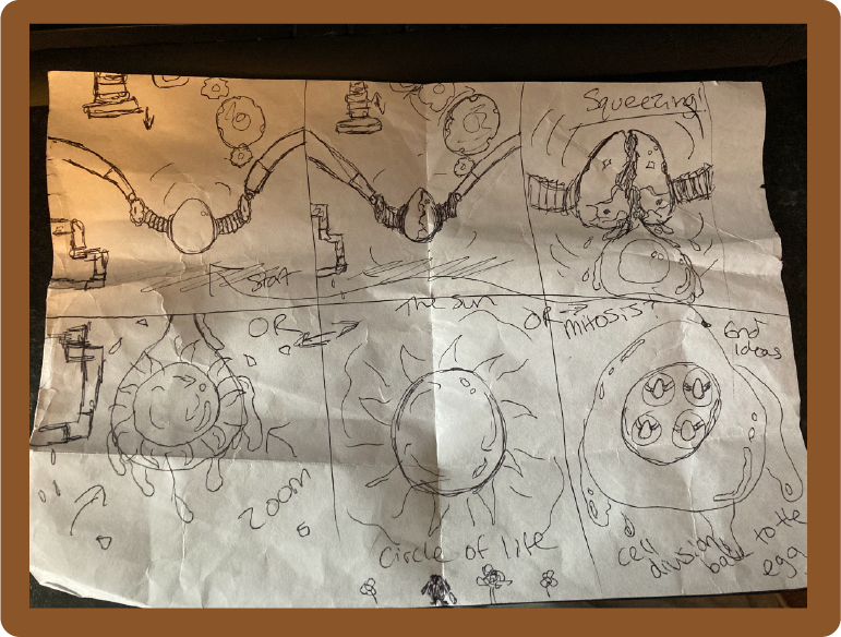
I initially chose the option to create an animated machine of some kind, and wanted to create a steampunk egg cracking machine, in which I was inspired by several niche and unique soviet animations, in one of which, i saw an egg rolling down a metal machine and being cracked. The conceptual design for this animation was going to be the egg being cracked, and the yolk turning into the sun, or an egg showing mitosis division, representing the circle of life.
Above is the storyboard idea i drew for this animation concept, but i realised that it was going to be too complex for me to create in blender, as i am new to the software and therefore could not execute this idea well enough to do it justice, and therefore decided to ask my peers for some constructive criticism and advice, and they advised that i try something different to keep things simple as possible.
Idea Two- The Liquid Transition

The secondary idea consisted of creating a moonshine jug in blender that slowly rotates, during which the drink liquid would pour down over it and temporarily abstract the view of it, in which the jug would then turn into the can, and having it revealed, still spinning, once the liquid had landed; however this presented issues with considering how well my PC would handle using liquid in this way on the software, and a peer had advised me it is very intensive, and so at this advice i wanted to try a different idea. Since i have never rendered before, i wasn’t sure how long it would take, and didn’t want the liquid to make the process much longer, and therefore being unreasonable.
Idea Three- The Sun Transition
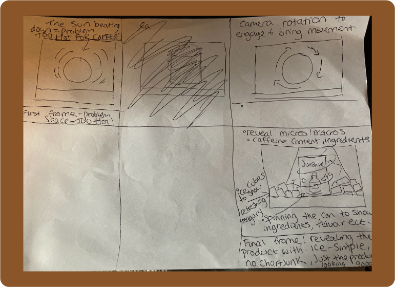
In this third idea, i drew a storyboard which shows a downward camera view onto an orange ball which would have texturing on it to make it resemble the sun, with the concept of the video being that this energy drink would be drank on hot days to replace coffee, which was inspired by the comment i had found on Quora where a lady stated she only drinks energy drinks when it’s too hot for coffee. The drink would be marketed with this as its unique selling point, and the sun would rotate and turn into the downward angle of the top of the can, to come down and show off the product, however i couldn’t get textures to work that looked like the sun and so decided to try a fourth and final idea.
Final Idea- The Cowboy Can
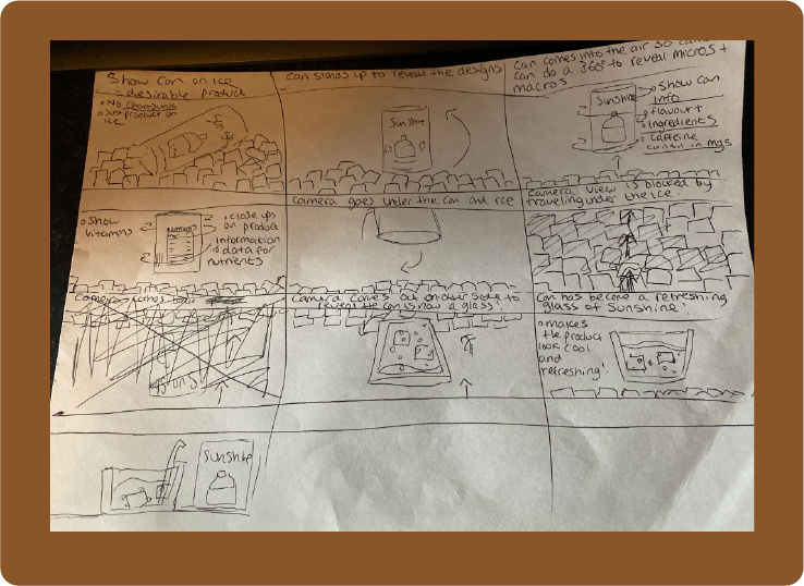
The final storyboard is what can be observed in the video, and is the idea I went with and executed on blender. It shows a can laying on ice cubes, and then standing up right, and rotating to display the typography and details on the can, as well as the micros/macros of ingredients and bullet points at the top, for flavour and caffeine content; The camera would then do close ups of these features, and then go underneath the drinks can, underneath the bed of ice cubes in a 360 movement, which would come back up to reveal that the can had transitioned into a class with the drink inside it. The concept was to make the drink look as refreshing as possible, and still holding to the idea of it being drunk when it is very hot out, which connotes the heat of “The Wild West”, and Southern America.
Visual Design Treatment- How Will I Incorporate Tufte’s Principles
Use Of Colour
Tufte on use of colour;
“He interestingly states that the main focus in using color to convey information is to avoid mishap ” (Z.Abubakar, 2018)
I will therefore be using a limited colour palette to highlight unique selling point information, and micros/macros, and to create a visual information hierarchy, as well as to evoke imagery to the brand from the audience (ginger, rustic woods, the old south in America, and the wild west, as well as porcelain MoonShine jugs).
Tufte’s principle of space over time
One way i will use Tufte’s Principles includes the use of animation itself as an example of displaying information over space and time, by showing the product in 3D, which will allow me to implement other qualitative and quantitative factors, such as flavour, caffeine content, vitamins, and the product’s unique selling point.
Closeread states on this:
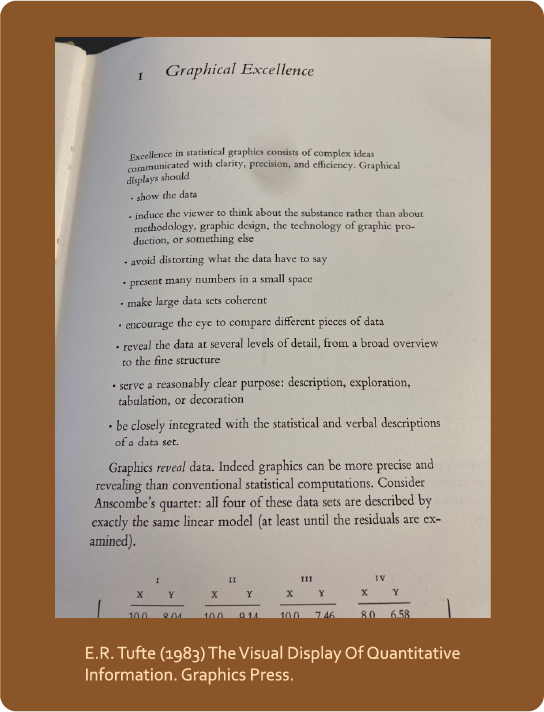
“An especially effective device for enhancing the explanatory power of time-series displays is to add spatial dimensions to the design of the graphic, so that the data are moving over space (in two or three dimensions) as well as over time.” (C.J Minard 1845-1869, Edward Tufte 1983, 2001)
Graphical Excellence And Micros and Macros
Another of his theories are Graphical Integrity and Micros/Macros.
Andrewtk quotes, on Edward Tufte’s Graphical Integrity,
“Visual representations of data must tell the truth” (Andrewtk (2020) Tufte’s Principles.)
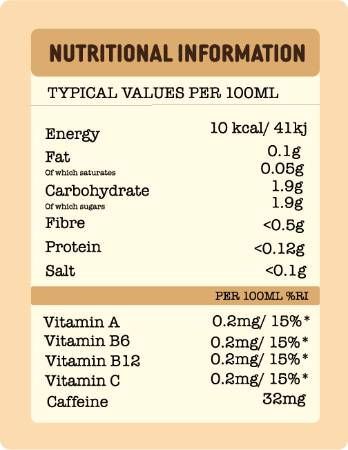
I will use Graphical Integrity by using Data Ink pragmatically, and Micros/Macros, which can be described as:
“Micro readings are in the form which contain details to the maximum possible granularity.” (S. Sampathkumar, Medium, 2019)
I will use this to show the granular details of the drink, specifically the ingredients in grams, and small bullet points on the can design which highlight unique selling points, which are all things that a health conscientious age group would want to know about this product.
Chart Junk
Another of Tufte’s principles is referred to as chart junk:
“He calls out moiré vibration, heavy grids and self-promoting graphs that are used to demonstrate the graphic ability of the designer rather than display the data” (Andrewtk (2020) Tufte’s Principles.)
The focus of the animation will be solely on the drink and necessary implementations of brand visuals to convey the drinks unique point of sale, and to make the drink appear desirable; These visuals will be used to describe the concept of the brand and flavour to the audience; the background and set will be minimalist, to draw attention to the product.
Small Multiples
Juice Analytics describes Tufte’s small multiples as:
“Small multiples use the same basic graphic or chart to display different slices of a data set. Small multiples can show rich, multi-dimensional data without trying to cram all that information into a single, overly-complex chart.” (Juice Analytics, N.D)
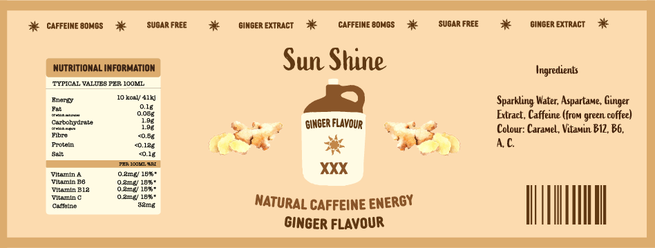
I will implement small multiples by focusing the camera and holding that focus on the features of small multiples on the can, which include, the flavour, and the unique selling points on the top of the can “ginger extract”, “caffeine content in mg’s”, and “sugar free”, with unique sun shapes bullet points to group the data and make it easy to distinguish.
Layering and Separation
Layering and separation refers to the effective use of layering information to convey a message or idea.
According to B.B. Zimmerman at Brigham Young University, Layering and Separation can be described as;
“Tufte defines layering as visually stratifying or ordering data thereby establishing a proper
relationship among types of information. The purpose of layering is to create a visual hierarchy” (B.B Zimmerman, Brigham Young University)
I will use this principle by creating a clear information hierarchy on the drinks can, from the name of the drink, to flavour, and then ingredients and a nutrients breakdown, as well as using the camera to display this information in the correct hierarchical order.
How I Implemented Tufte’s Design Principles
Use Of Colour
I used the specified above conceptual colour palette seen in the Sun Shine typographical standards, which consists of browns and clay colours inspired by Moonshine jugs, copper pipes and old barrels used in secret brewing rooms when alcohol was illegal during prohibition in America, (please see Figjam mood boards above for inspiration references), as well as desert colours, to evoke connotations of a hot, dry environment, in addition to the colour of ginger, as this is the flavour of the drink. I used these colours not only to create information separation and hierarchy on the can, but also to invite people to use their semantic memory, as proposed by Tufte, to incite all of the above, and make the drink seem more desirable, something to quench thirst in hot weather, when it’s too hot for warm drinks.
I also used these similar colours in the sunny HDRI environment in blender, which casts a desert like light over the animation, to re-enforce the above semantics.
Use of colour and HDRI in final animation
Space Over Time
I used Tufte’s Space Over Time to reveal data through movement in a way that is easy for the audience to understand. Data is shown in hierarchical order to present the product at hand, its concept and conceptual colours, the context for the drink, and small multiples and macros for the ingredients and selling points. Over time , a goal is revealed also, which paints the product in a favourable light, (to have a nice glass of Sun Shine).
Micros Macros
TuftePrinciples.pdf (N.D.) from Envisioning Information and The Visual Display of Quantitative Information
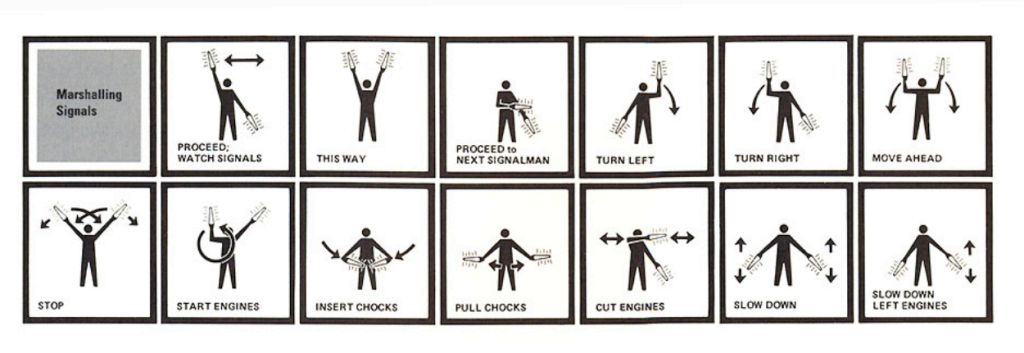
The video utilizes micros/macros with product design, and use of colour to separate and modulate information in a way that is clear to discern and distinguish, for example, typography for flavour and brand name, as well as contents information, and then ingredients has a clear border around it to make it easy to understand, much like Tufte’s marshalling signals infographic.
Small Multiples
The drinks can contain examples of small multiples in that there is information all over the can in modulated bits, that the camera also displays in modulated sections using movement. One such example is that the logo, which is a Moonshine jug, always contains information which is the flavour of the drink, and the typography under it shows that the drink contains energy from natural sources. (Please refer to the net design of the can above)
Layering And Separating
In the video, the can is one layer, and the background and other objects are another; one gives qualitative data, and the rest convey a conceptual message to the audience, such as the products unique point of sale, and why it is desirable, what the brand is about, what the aesthetic is of the brand, and in what conditions the drink is ideal to be drank in, as well as subtle undertones and homage to the history of Moonshine, the south, and Appalachia. (Refer to the video below for evidence of visuals)
Sun Shine Animation
Harvard References
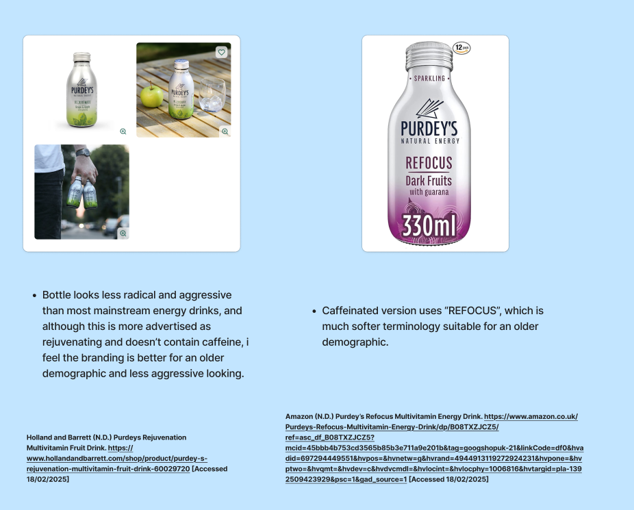
Amazon (N.D.) Purdey’s Refocus Multivitamin Energy Drink. https://www.amazon.co.uk/Purdeys-Refocus-Multivitamin-Energy-Drink/dp/B08TXZJCZ5/ref=asc_df_B08TXZJCZ5?mcid=45bbb4b753cd3565b85b3e711a9e201b&tag=googshopuk-21&linkCode=df0&hvadid=697294449551&hvpos=&hvnetw=g&hvrand=4944913119272924231&hvpone=&hvptwo=&hvqmt=&hvdev=c&hvdvcmdl=&hvlocint=&hvlocphy=1006816&hvtargid=pla-1392509423929&psc=1&gad_source=1 [Accessed 18/02/2025]
Holland and Barrett (N.D.) Purdeys Rejuvenation Multivitamin Fruit Drink. https://www.hollandandbarrett.com/shop/product/purdey-s-rejuvenation-multivitamin-fruit-drink-60029720 [Accessed 18/02/2025]
Amazon (N.D) Whole Earth Organic Sparkling Water. https://www.amazon.co.uk/Whole-Earth-Organic-Sparkling-Ginger/dp/B01M1ULZP5/ref=asc_df_B01M1ULZP5?mcid=bbb39c1fe6a53d99bb9495edc1461424&th=1&hvocijid=299083184167508758-B01M1ULZP5-&hvexpln=74&tag=googshopuk-21&linkCode=df0&hvadid=696285193871&hvpos=&hvnetw=g&hvrand=299083184167508758&hvpone=&hvptwo=&hvqmt=&hvdev=c&hvdvcmdl=&hvlocint=&hvlocphy=1006514&hvtargid=pla-2281435178298&gad_source=1 [Accessed 07/03/2025]
Music by Anastasia Chubarova (N.D.) Western Duel. Music_For_Videos. Pixabay [Download] https://pixabay.com/music/modern-country-western-duel-165284/ [Accessed 09/03/2025]
Andrewtk (2020) Tufte’s Principles. [Blog Post] The Double Think. 28th August. https://thedoublethink.com/tuftes-principles-for-visualizing-quantitative-information/ [Accessed 28/01/2025 ]
Brio (N.D) Natural Energy Drink. https://brio-energydrink.co.uk/products/ginger-1?selling_plan=690214404373&variant=48505031262485 [Accessed 07/03/2025]
B.B Zimmerman (N.D) Applying Tufte’s Principles of Information Design to Creating Effective Web Sites. Brigham Young University. https://citeseerx.ist.psu.edu/document?repid=rep1&type=pdf&doi=8bf3f70bbfe6cd95eb00fb5e7e6a72ebf2d82fe6 Page 309. [Accessed 07/03/2025]
Case Antiques (N.D.) Lot 853: 4 Louisville KY Liquor Advertising Jugs. https://caseantiques.com/item/lot-853-4-louisville-ky-liquor-advertising-jugs/ [Accessed 20/02/2025]
Charles Joseph Minard, Tableaux Graphiques et Cartes Figuratives de M. Minard, 1845-1869, a portfolio of his work held by the Bibliothèque de l’École Nationale des Ponts et Chaussées, Paris, as reproduced in Edward R. Tufte, The Visual Display of Quantitative Information (Cheshire, Connecticut © 1983, 2001), p. 176 [Accessed 26/02/2025]
Closeread (N.D.) The Visual Display Of Quantitative Information-Close Read.https://closeread.dev/gallery/examples/minards-map/#fnref1 [Accessed 26/02/2025]
E.R. Tufte (1983) The Visual Display Of Quantitative Information. Page 1. Graphics Press.
- (N.D) Protect- G spot drinks. https://thisisgspot.com/products/protect?variant=47279895150906&country=GB¤cy=GBP&utm_medium=product_sync&utm_source=google&utm_content=sag_organic&utm_campaign=sag_organic&gad_source=1&gclid=CjwKCAiAlPu9BhAjEiwA5NDSA57WN9eYpSi3iCtCT4pW6FcqiXnwFx7HkuRlkx59_G1EZvxpyfB26RoCYQUQAvD_BwE [Accessed 07/03/2025]
Grass & Co (N.D) Liquid POWER, Ginger, Lime and Shiitake drink. https://grassandco.uk/products/liquid-power?srsltid=AfmBOorz9v8cKTupKYOJJcgWzYJnq3OgGRDU1IPYYLiUhEzrzdBega3r&selling_plan=10237608257 [Accessed 07/03/2025]
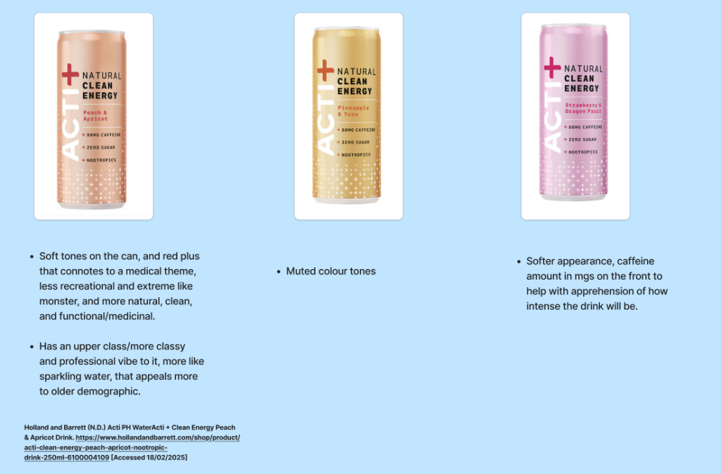
Holland and Barrett (N.D.) Acti PH WaterActi + Clean Energy Peach & Apricot Drink. https://www.hollandandbarrett.com/shop/product/acti-clean-energy-peach-apricot-nootropic-drink-250ml-6100004109 [Accessed 18/02/2025]
Holland and Barrett (N.D.) Purdeys Rejuvenation Multivitamin Fruit Drink. https://www.hollandandbarrett.com/shop/product/purdey-s-rejuvenation-multivitamin-fruit-drink-60029720 [Accessed 18/02/2025]
Joseph Natti (N.D.) What is an energy drink for women above 50 years old? Qurora. https://www.quora.com/What-is-an-energy-drink-for-women-above-50-years-old [Accessed 18/02/2025]
Juice Analytics (N.D.) Better Know Visualization: Small Multiples. https://www.juiceanalytics.com/writing/better-know-visualization-small-multiples [Accessed 08/03/2025]
messrskoonyfootseven (N.D.) Skin Tones Color Palette. Color Hex
Mother Root (N.D) Mother Root Ginger. https://www.amazon.co.uk/Whole-Earth-Organic-Sparkling-Ginger/dp/B01M1ULZP5/ref=asc_df_B01M1ULZP5?mcid=bbb39c1fe6a53d99bb9495edc1461424&th=1&hvocijid=299083184167508758-B01M1ULZP5-&hvexpln=74&tag=googshopuk-21&linkCode=df0&hvadid=696285193871&hvpos=&hvnetw=g&hvrand=299083184167508758&hvpone=&hvptwo=&hvqmt=&hvdev=c&hvdvcmdl=&hvlocint=&hvlocphy=1006514&hvtargid=pla-2281435178298&gad_source=1 [Accessed 07/03/2025]
https://www.color-hex.com/color-palette/547 [Accessed 20/02/2025]
Nicole Miller (2022) Appalachian White Lightnin’ A Brief History Of Moonshine. Mobile Brochure. 29th August. https://www.mobilebrochure.com/smoky-mountains/mobile-explorer/alcohol/appalachian-moonshine-history/ [Accessed 07/03/2025]
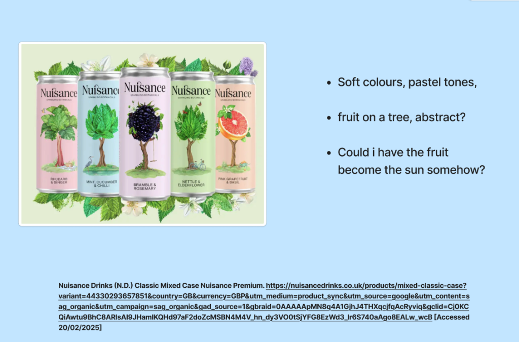
Nuisance Drinks (N.D.) Classic Mixed Case Nuisance Premium. https://nuisancedrinks.co.uk/products/mixed-classic-case?variant=44330293657851&country=GB¤cy=GBP&utm_medium=product_sync&utm_source=google&utm_content=sag_organic&utm_campaign=sag_organic&gad_source=1&gbraid=0AAAAApMN8q4A1GjhJ4THXqcjfqAcRyviq&gclid=Cj0KCQiAwtu9BhC8ARIsAI9JHamIKQHd97aF2doZcMSBN4M4V_hn_dy3VO0tSjYFG8EzWd3_lr6S740aAgo8EALw_wcB [Accessed 20/02/2025]
O’donnel moonshine (N.D.) Flavour of the month. https://odonnellmoonshine.co.uk/pages/fotm-tough-nut?srsltid=AfmBOopQbFQDuMrD-ED8Z1X7M5ieUoqAGbZR69LprcpU8Y2aOI-w4kGO [Accessed 26/02/2025]
Ozark Moonshine Festival (2023-2025) History of Moonshine. https://ozarkmoonshinefest.org/history/#:~:text=The%20surprising%20story%20of%20Moonshine&text=The%20name%20moonshine%20is%20really,often%20associated%20with%20Southern%20culture. [Accessed 07/03/2025]
Perri Ormont Blumberg (2022) How to plan a perfect trip to the Appalachian mountains. [Blog Post] Travel+ Leisure. August 9th. https://www.travelandleisure.com/trip-ideas/best-things-to-do-in-the-appalachian-mountains [Accessed 26/05/2024]
PureStock (N.D) Free Ginger Vector Images. File: 574627729 Adobe Stock. https://stock.adobe.com/uk/search/free?k=ginger+vector&search_type=recentsearch&asset_id=574627729 [Download] [Accessed 01/03/2025]
S. Sampathkumar (2019) Micro/Macro Readings. https://medium.com/@shurisk96/micro-macro-readings-cd987ce6bc63 [Accessed 08/03/2025]
SugarLands (N.D.) Sugarlands distilling company https://www.sugarlands.com/ [Accessed 26/02/2025]
TuftePrinciples.pdf (N.D.) from Envisioning Information and The Visual Display of Quantitative Information https://websites.umich.edu/~mmmc/516/notes/TuftePrinciples.pdf [Accessed 10/03/2025]
Zidane Abubakar (23rd October, 20218) Edward Tufte: Colour and Information CMS.633/833 Digital Humanities. https://cms633.github.io/Fall-2018/commentary/edward-tufte-color-and-information.html#:~:text=Right%20off%20the%20bat%20in,great%20designs%20and%20color%20combinations. [Accessed 08/03/2025]