Development Log
Please see below my research Figjam board for this assignment
Planning Phase- Project Goals
UI/UX
According to Reload UX, “Invest in visually appealing design elements that align with your brand identity. Use high-quality images, well-chosen color schemes, and typography that is easy to read. Aesthetically pleasing layouts with proper spacing and visual hierarchy can guide users’ attention and create a positive impression.” (UI UX Design for Improving User Retention – Top 7 Best Customer Retention Strategies – reloadux)
In this project i am going to do a complete brand conceptual redesign for the Rooted In Hull website, using colour, composition, typography, information architecture to create graphical hierarchy, and improve the ease of information digestion and aesthetics when visiting the website, as well as making the site memorable with better UI/UX; as well as possible animations such as parallax, and button movements, to make the website feel more pleasant and memorable to use, thus hopefully creating returning users, and sparking interest about Rooted In Hull.
Branding and Colour

(Purple Planet (N.D) The Psychology Behind Colour in UI and UX Web Design [Blog Post] Purple Planet. (N.D) https://purpleplanet.com/blog/the-psychology-behind-colour-in-ui-ux-web-design/ [Accessed 26/11/2024]
I will undertake a design rebrand, which will revolve around the apiary, bees, and how selling
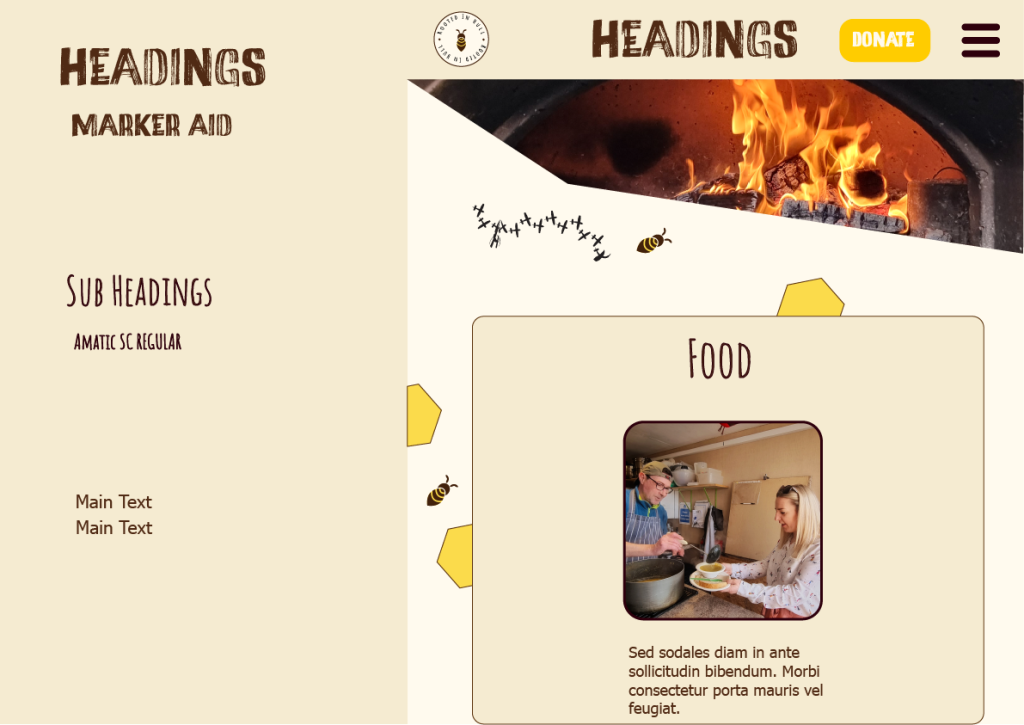
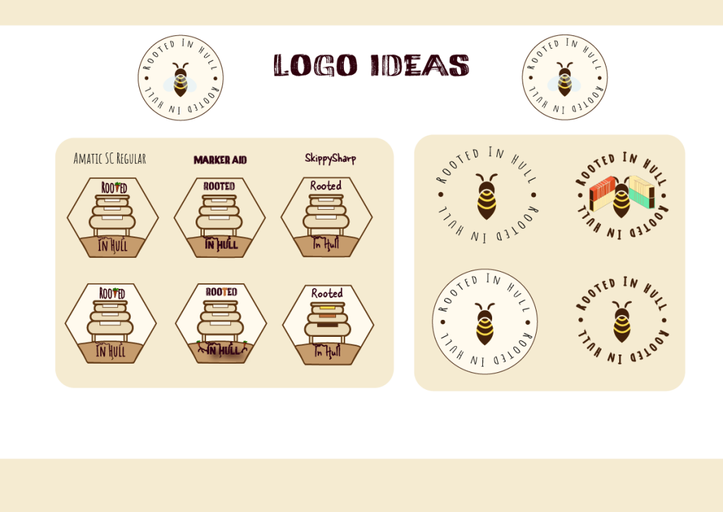
honey could be a good donation source; and will undertake this via colour and logo, making the website more conceptual and marketable. To do this i will choose a new limited colour palette for the website (soft, light honey yellows, and light browns, with burnt umber brown text, to make it more aesthetically pleasing, as well as implementing a new conceptual honey themed logo which has more of a focus on the selling points of the organisation (the honey from the apiary), which could improve conversion rates of donation though selling honey, whilst still staying true to the meanings of Rooted In Hull.
Ethics
(Justyna Weronika Łabądź (2023) Sustainable Web Design. Why And How To Create a Sustainable Website? [Blog Post] Dodonut. August 24th. Sustainable Web Design. Why And How To Create a Sustainable Website? | Dodonut [Accessed 26/11/2024])
I will also implement an ethical audit of the website, reducing pictures, optimising them so that they use less energy, as well as aiding storytelling and narrative by using illustrated vector infographics and heroes.
Accessibility
Ramotion states about accessibility and UX, “needs of users always take center stage so that their lives are made easier. In the field of UX design, diversity is appreciated, and a product is successful only when it sticks to this standard.” (Accessibility in UX Design: Guidelines and Key Principles | Ramotion Agency)
This means that the information on the website should be made more readable; i want to achieve this by making the typography, font, and size, as well as the information volume per section, more accessible through the implementation of an “accessibility button interface” which can offer certain amendments to the UI such as mouse size, and font size; as well as compartmentalising the information to avoid overwhelming those in the Neuro-Divergent bracket, aided with the use of infographics and pictures. Furthermore I will also implement a cookies icon which can expand to show cookie options in a way that is more easy to understand and manageable for people.
E-Commerce
Hallam states that donation integration should be an easy and seamless experience, allowing people to donate easily online; i want the website so have these extra pages so users can easily purchase urban honey, after reading about the mission of Rooted, helping them raise funds, and receiving something in return that could create returning users and donations for the future; they state
“One of the most important things for a non-profit is how visitors donate online. Including donation integration and designing the experience so it is seamless for visitors to use is super important. You don’t want a lousy experience design to block visitors, making them give up and give their money elsewhere. ” ( Designing for impact: unique features of non-profit websites — Hallam)
I will add pages for purchasing urban honey, as well as a checkout feature, and a basket icon, so that people can buy honey straight from Rooted In Hull and have it shipped across the country, in order to raise funds for the organisation, furthering their goals, which is to convert more shipping containers, and host more events where they can feed and entertain people.
Their sentiment on needing more donations can be seen on their website, stating,
“We have received funding for our work over the years from a number of organisations including the National Lottery, Comic Relief and The Rank Organisation. These funds are highly sought after and due to the current economic climate, are grossly oversubscribed. Whilst this situation is not ideal, funding organisations are currently our main source of income, and writing bids that accurately represent the work we do at Rooted is still an important and time consuming process.” ( Social Enterprise – Rooted in Hull)
Initial Sketches And Nav Flow Diagrams
Mobile
Desktop
Mobile First Wireframes
For my initial sketches, I have started with the design of the mobile website, as I want to design using “Mobile First” technique, as this has significant benefits for the uniformity of implicating the design across platforms, making it a more responsive design choice.
According to Webflow, it is important to acknowledge the rise of the use of web browser over desktop, making it a more sensible choice to start the design process with:
“Mobile-first design starts with optimising the user experience for mobile devices before scaling up the design to larger screens, such as laptops and desktops.
With this approach, developers and designers recognize the increasing prevalence of global mobile users.
They strive to create websites and applications that captivate and function well on smaller screens so they can offer users seamless digital experiences regardless of the device.” (https://webflow.com/blog/mobile-first-design)
Mid Fidelity Wireframes
Logo and Typography
User Evaluation And Changes
Keeping Articles For SEO Feedback
At the advice of my professor, I was encouraged to remember to keep the original sentiment of the motives for the Rooted In Hull website, as well as considering keeping the articles on the bottom of each page, as it can aid in SEO making the page more discoverable to Google.I will keep the articles section as it was on the original website for the sake of SEO, however i do feel this is a necessary trade off in terms of environmental ethics, in order for the website to be best discoverable.
Logo Designs Feedback
It was suggested to me that i add some form of shipping containers to one of the logos as a homage to the renovated containers Rooted uses; in response to this i used the 3D shapes function on illustrator to create some containers, and coloured them in the blue and orange of the original logo, but with softer tones to fit the re-brand, however the finished logo looked busy and i was not happy with how it looked, and so decided to choose the logo most people gave positive feedback on.
Another piece of feedback included that the text was not perfectly arched with the circle shape, and caught the eye in a bad way, to which I added a higher arch to make the type go around the circle in a more pleasing way, thus making the logo look more professional for the website.
My classmates all preferred the circular bee logo with the beige background out of all other options and so this is the logo I will be going with. I also received advice from James suggesting that I add some lightly blue coloured, transparent wings to the bee to make it more realistic and aesthetic, which I then added to the logo. I decided that it does very much improve the logo and makes it look more professional.
Overall Layout and Appearance/ UI/UX
My peers said that they really liked the typography, and the overall layout of website mid fidelity prototypes, and therefore not much will be changed upon going into the high fidelity prototypes as they did not have any criticism on the layouts, however one peer suggested i make the bee parallax have some animation for the flight of the bee. I do not think I have the ability nor experience yet to execute any animations efficiently, but I have taken this idea onboard for my future work, as it could make websites much more responsive and memorable. Another peer said the branding looks very good, and that the call to action buttons are very clear so nothing will be changed about these. One peer also said that the honey on the information box adds a lot to it, and so i will be following these through into final designs also.
High Fidelity Designs
Technical Challenges and Solutions
Problem One: Initial Desktop Sketches Aren’t Pragmatic
My initial sketches for the desktop site where too complicated and did not utilise space very well; it would also have been really laborious and difficult to implement in the design process, and did not fit with the honey bee concept ideas i would later have for the website, and so this idea had to be scrapped completely and replaced. Furthermore, before I had learned about the practical benefits of using mobile first design, I had drawn these during class as very first initial ideas, and so they did not fit the theme and rebranding that I wanted to do for Rooted In Hull.
Problem Two: Email Address In Mobile Web Banner
One problem i had in the redesign of Rooted in Hull was that the website had its email address in the top banner of both mobile and desktop; desktop has enough space to accommodate this, however the mobile banner really has very limited space, and i felt it would be wise to refine this space and have it not be overwhelmed with information as soon as you load in, and so therefore i have decided to relocate the email address into the contact section of the mobile design, so free up the top banner for a donate button, as well as typography and logo.
Problem Three: Donation Pages Not Functioning
A second issue is that the donation pages do not have any sort of check out feature on the original Rooted In Hull website, and so I am going to have to design these pages completely from scratch. I will undertake this as I have done the rest of the site, by doing it mobile first and looking at similar checkout pages.
Problem Three: The Addition Of E-Commerce Functionality
According to Statista
“In 2024, the country is expected to have about 50 million e-commerce users — leaving non-digital buyers as a minority of the total population.”
Which is why I wanted to rebrand rooted in hull to focus on the apiary, as i think it presented an interesting, fun, and unique selling point, which could be played in conceptually in terms of theme, colour, and illustrations, and typography; not only this but also a way to drive sales to gain more donations which could be used to upgrade/renovate more shipping containers for the organisation/ or put on more creative events/ feed more people. One way I wanted to implement this was through adding a cart functionality, as well as a “purchase honey page”. Technical issues include creating a checkout system, cart icon, and an entire new page for purchasing honey.
Furthermore, Forbes Advisor states,
“By 2025, the proportion of all UK retail sales made online is predicted to reach 38.1% – amounting to a value of £152 billion or $194.1 billion”
It seemed appropriate to take advantage of this and use the website to sell some honey, potentially around the UK.
Problem 5: Logo Issues With Keeping Entirety Of Sentiment And Context/ Adding Wings
It was suggested to me that the logo does not combine the entire sentiment of Rooted, and i have found this incredibly difficult due the organisation being so multi-faceted; it was hard to combine sentiments of converted shipping containers, food growth, social evenings, feeding people, urban honey, sustainability, and aiding the homeless, into one consistent logo, which can be identified via a single silhouette. It has been extremely difficult to sum this up, as most people still wouldn’t get the immediate sentiment from the logo anyway as Rooted In Hull really requires prior knowledge to be able to understand what they do. I have gone with the bee logo as it fits the re-branding, allows for e-commerce functionality for donations, and connotes pollination, and growth of flowers, vegetables, and the production of honey.
Harvard References
Faizan Khan (2024 UI UX Design for Improving User Retention -Top 7 Best Customer Retention strategies) reloadUX. July 25th https://reloadux.com/blog/ui-ux-design-for-improving-user-retention/ [Accessed 26/11/2024]
(Justyna Weronika Łabądź (2023) Sustainable Web Design. Why And How To Create a Sustainable Website? [Blog Post] Dodonut. August 24th. Sustainable Web Design. Why And How To Create a Sustainable Website? | Dodonut [Accessed 26/11/2024])
Katherine Shelly (2024) Designing for Impact: Unique Features Of Non-Profit Websites. [Blog post] Hallam. 25th September Designing for impact: unique features of non-profit websites — Hallam [Accessed 26/11/2024]
Kristy Snyder. Laura Howard. (2024) 35 E-Commerce Statistics of 2024-Forbes Advisor UK. Forbes Advisor. June 12th. https://www.forbes.com/uk/advisor/business/ecommerce-statistics/ [Accessed 16/11/2024]
(Purple Planet (N.D) The Psychology Behind Colour in UI and UX Web Design [Blog Post] Purple Planet. (N.D) https://purpleplanet.com/blog/the-psychology-behind-colour-in-ui-ux-web-design/ [Accessed 26/11/2024]
Ramotion (2022) Accessibility In UX Design: Guidelines and Key Principles [Blog Post] Ramotion (May 25th) Accessibility in UX Design: Guidelines and Key Principles | Ramotion Agency [Accessed 26/11/2024]
(Rooted In Hull (2024) Social Enterprise-Rooted In Hull. Social Enterprise – Rooted in Hull [Accessed 26/11/2024])
Statista Research Department (2023) E-commerce in the UK – Statistic & Facts. Statista. September 24th. https://www.statista.com/topics/2333/e-commerce-in-the-united-kingdom/#topicOverview [Accessed 16/11/2024]
Webflow Team (2024) A Guide To Mobile First Design. Webflow. January 9th. https://webflow.com/blog/mobile-first-design [Accessed 09/11/2024]