App Rejected Wireframes
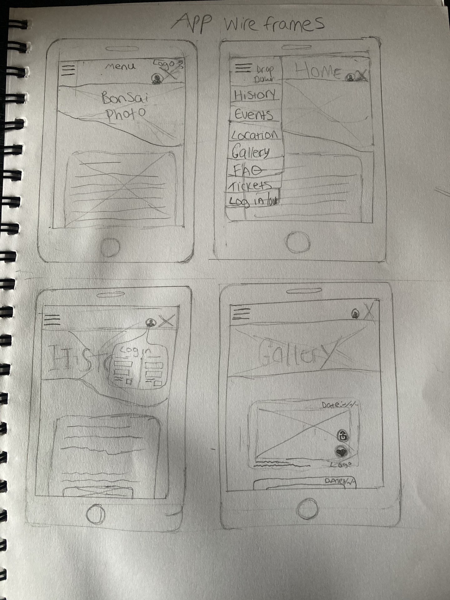
This wireframe is a rejected design due to its messy and overwhelming layout, in addition to there being too many menu items. Features that do add usability to the UI include the user profile image which most people are used to seeing as the symbol for logging in or signing up.
Here is a secondary app rejected design; this is due to the layout being harsh due to straight edges around the banner photographs. The goal is to create a UI that is simple and not intimidating to use for the older generation, which this does not achieve well.
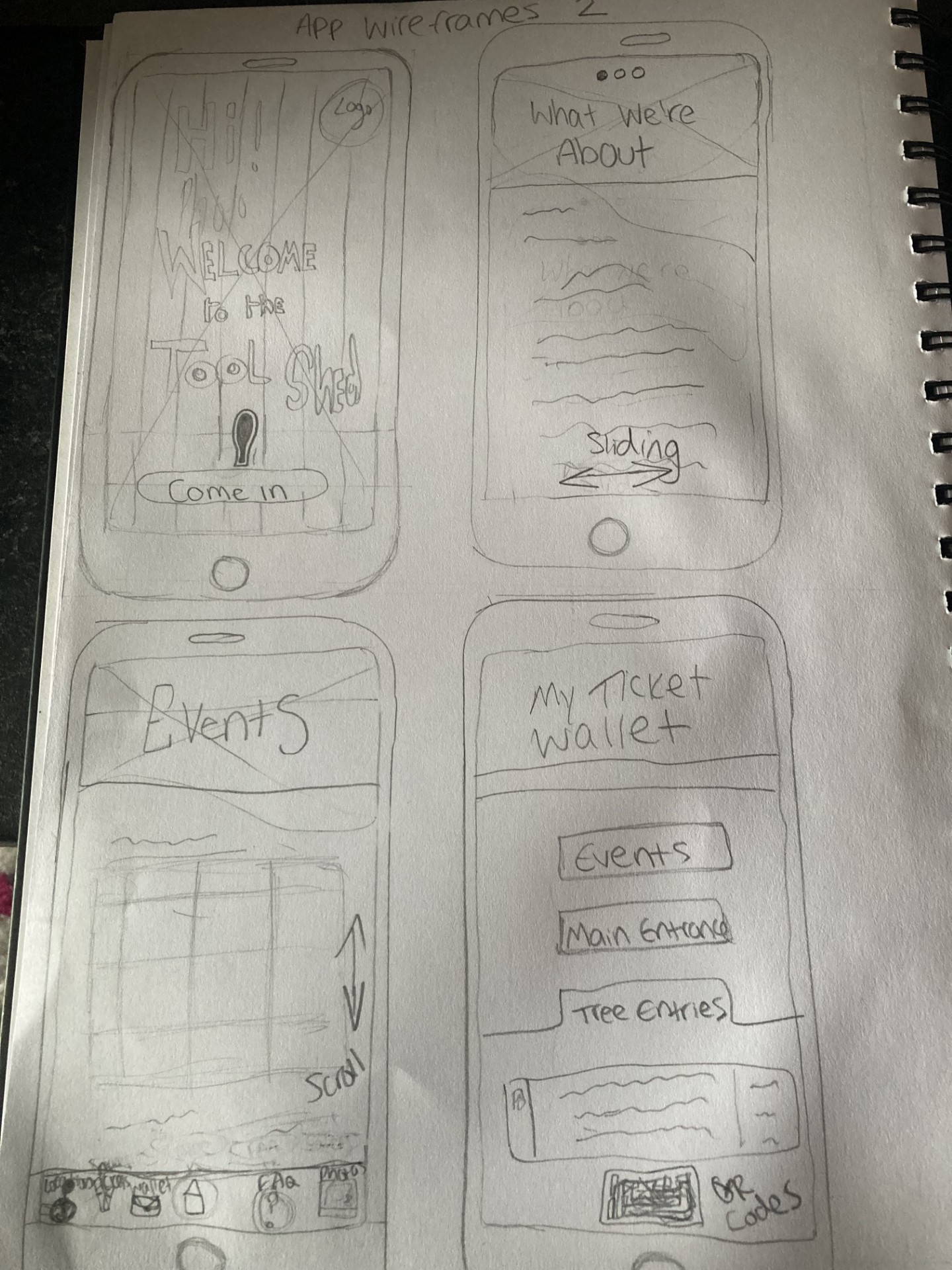
Features that are memorable and useful include the scrolling dot buttons to show the user the slide they are on, as well as the welcome interface to add elements of fun. In addition to this, the ticket wallet UI interface is treading the right line, but the subheadings are not specific enough and are confusingly titled.
Website Rejected Wireframes
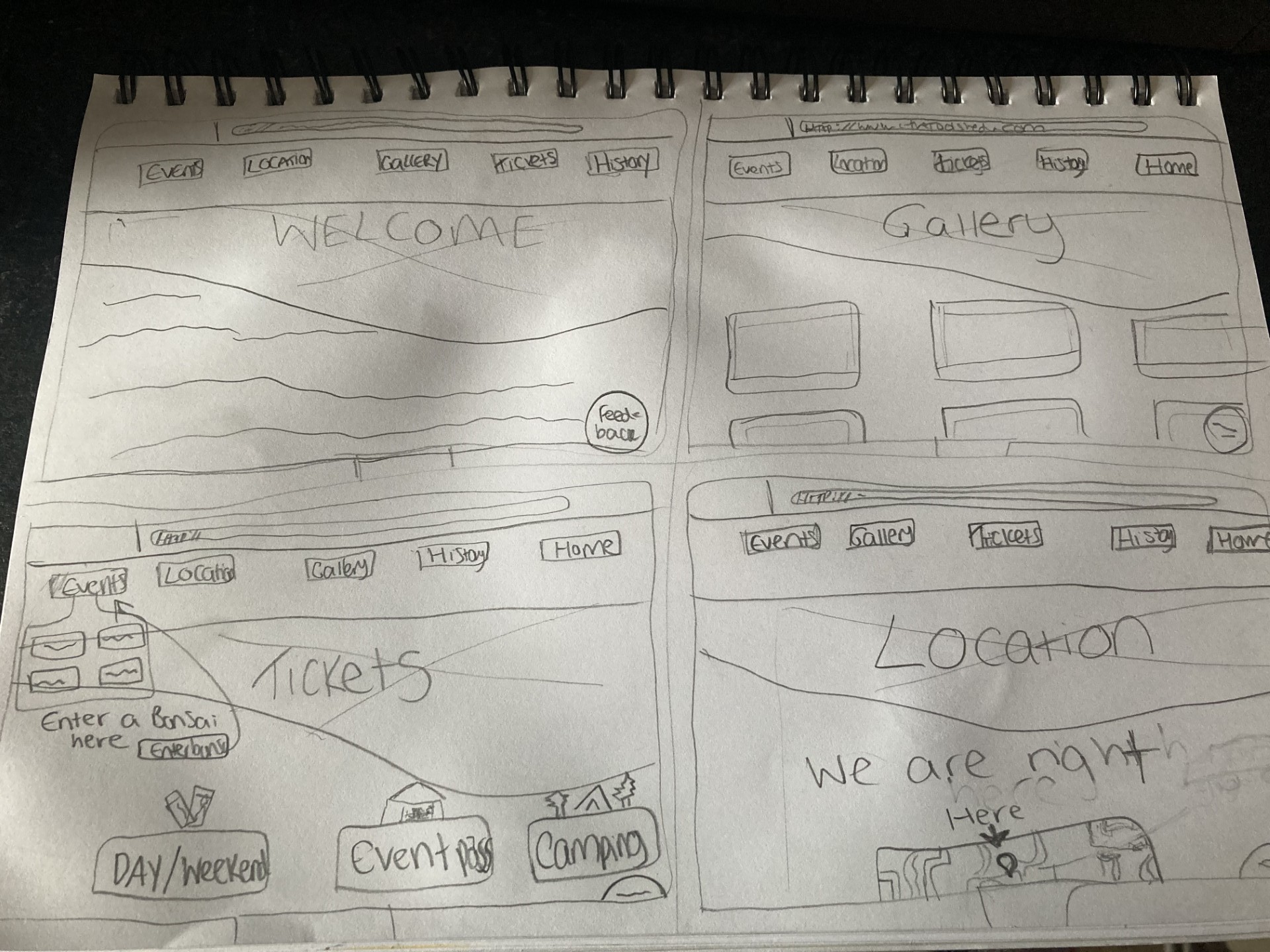
Above is a rejected wireframe for the website; it is rejected due to it being boring and lacking anything engaging. A keepable feature from this wireframe is the feedback widget tool which resides as a small clickable dot in the bottom right hand corner, and would allow users to give feedback on the website.
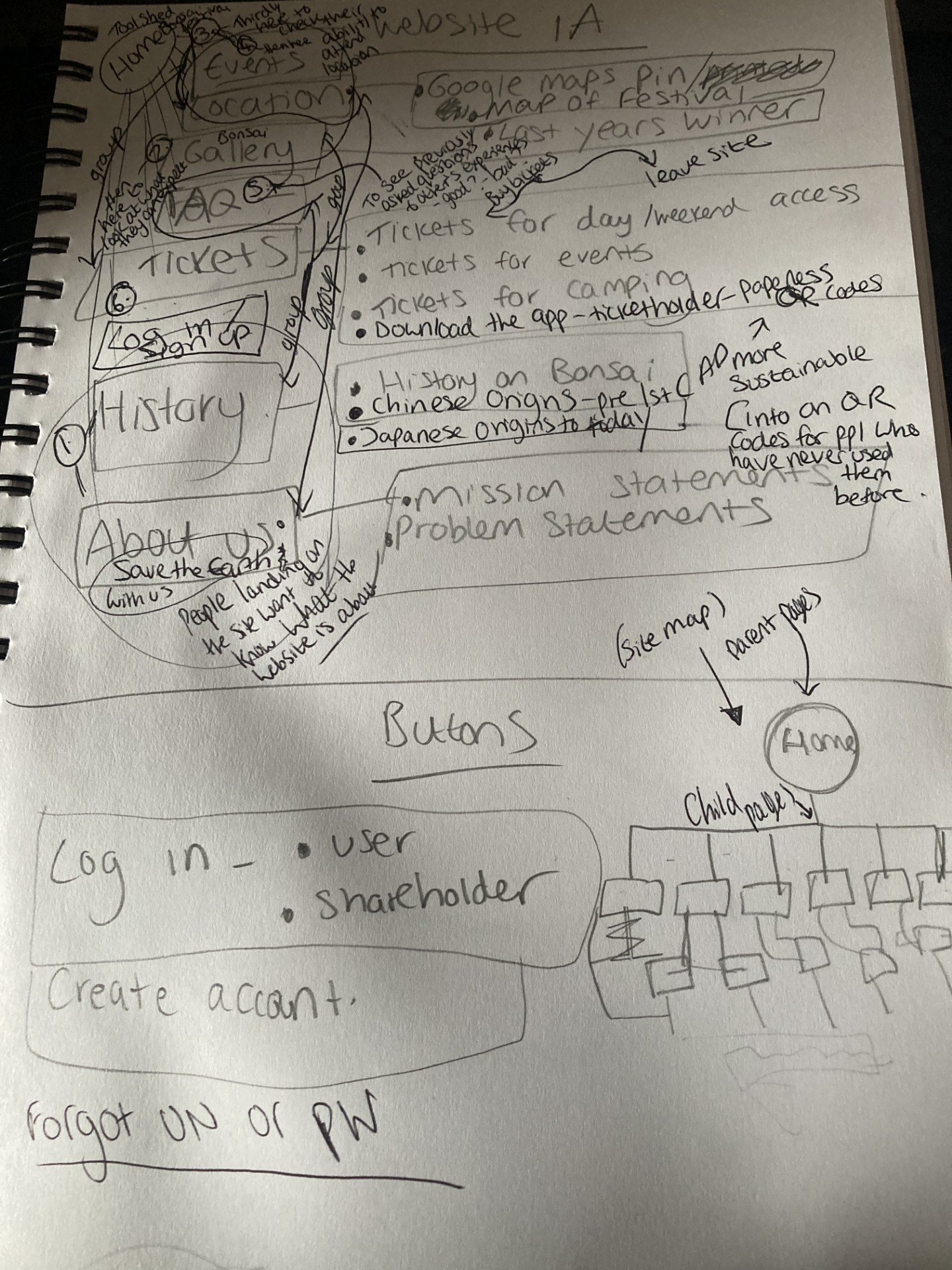
Above are my notes in which I used to write down all possible headings and subheadings for the website, and then order them numerically from least to most important in user interest, and what order the user will visit the pages. It contains the discarding of the previous heading system, and the formulations of regrouping contextually relevant headings together as further child pages.
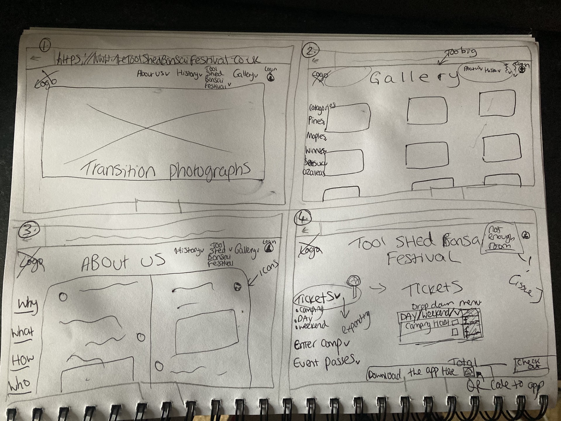
Above is the second rejected wireframe for the web UI; though it contains a large use of white space, which is the aim, there was not enough room at the top right hand corner for all of the headings to fit on there, even when reduced in number.
Usable features include white space, drop down headings/menus, and the tickets purchasing interface.