Website Prototypes
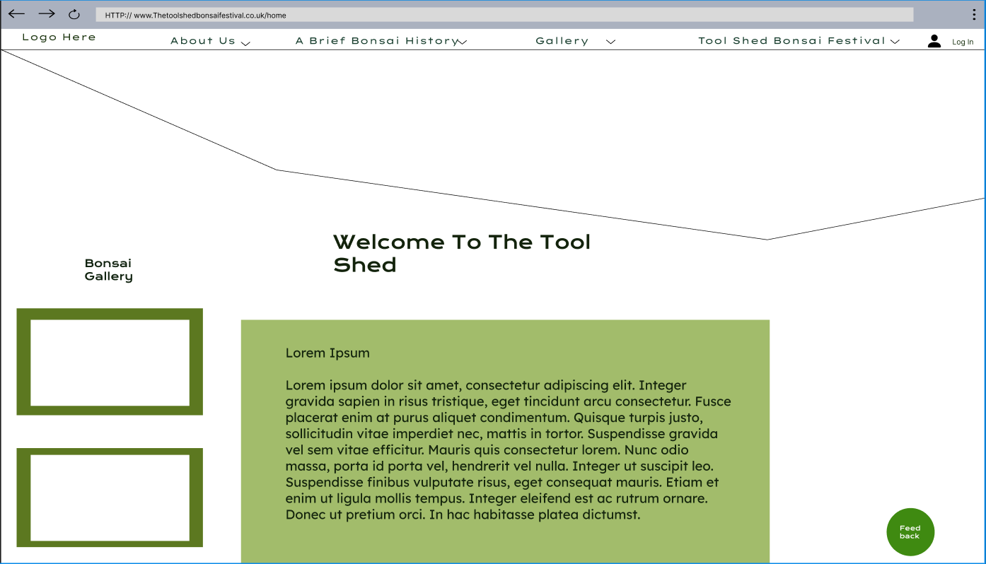
Above is the home/landing page for the website. I have chosen to categorise many headings as children categories so as to be able to have them be available when hovering over the parent heading e.g. ‘About Us’ Will then drop down to have the following ‘Stakeholders and Charities’, and so on and so forth for the other parent headings.
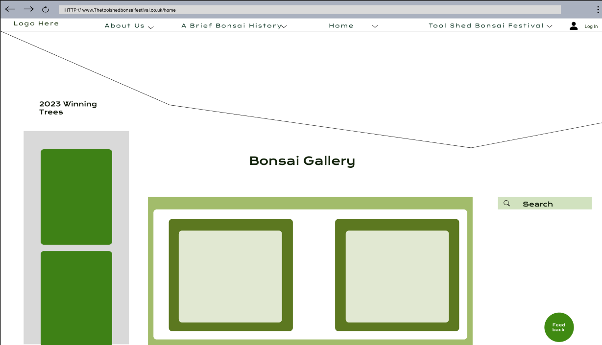
The gallery layout
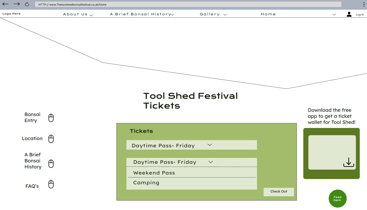
The ticket interface has been made less difficult by including drop down menus, in which the user can select which ticket they prefer, and then click the check out bottom in the bottom right. In the right middle is an advertisement to encourage ticket purchasers to download the app the access the ticket wallet feature.
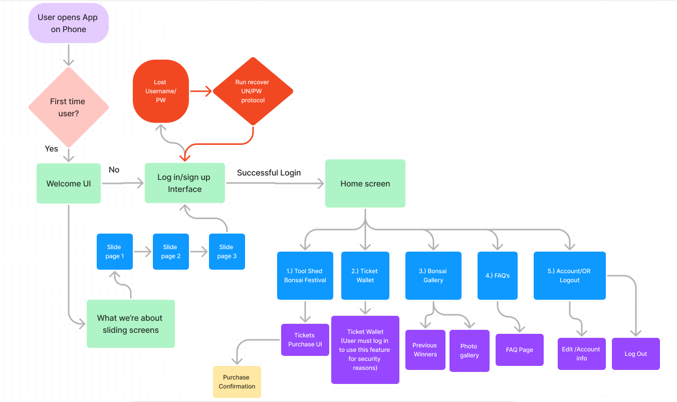
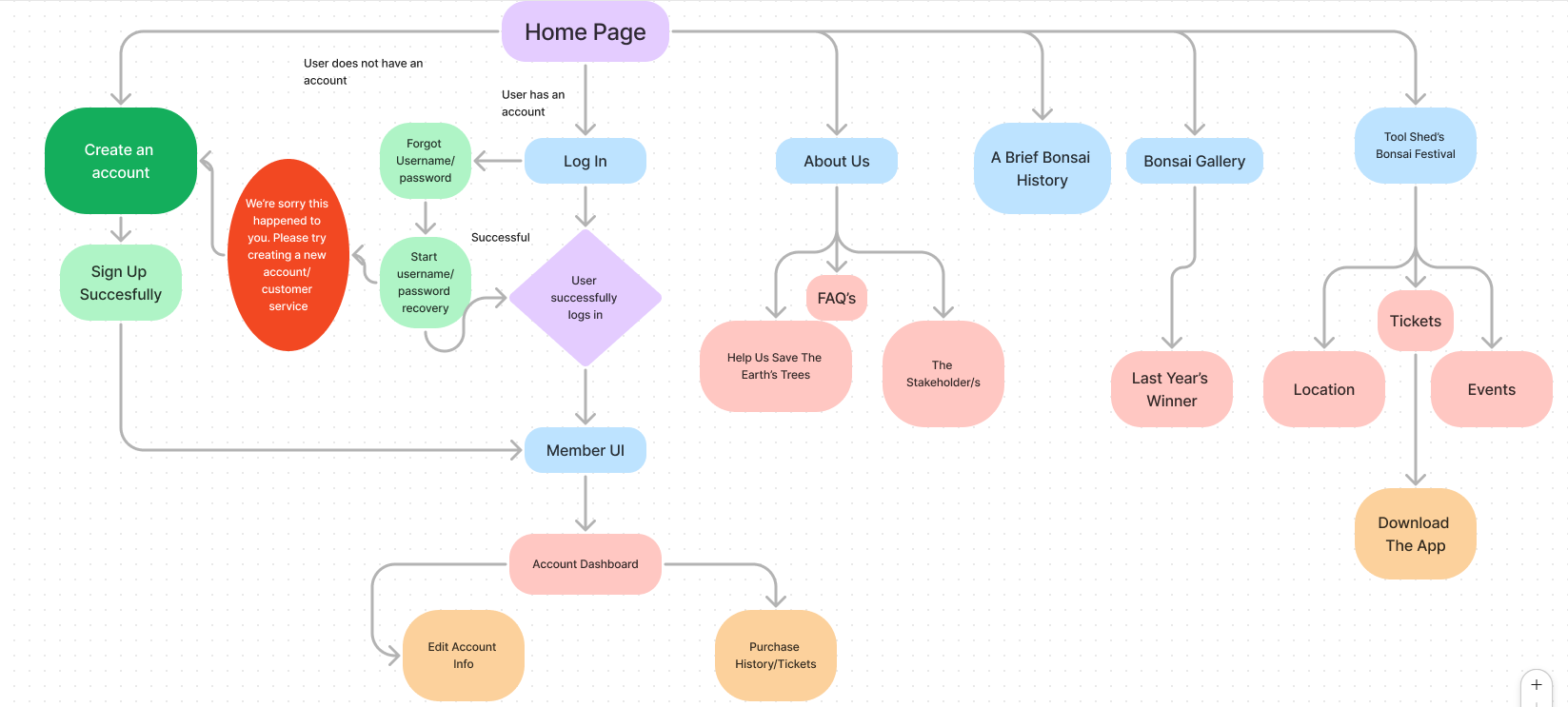
Navigation Map
App Low Fidelity Prototypes
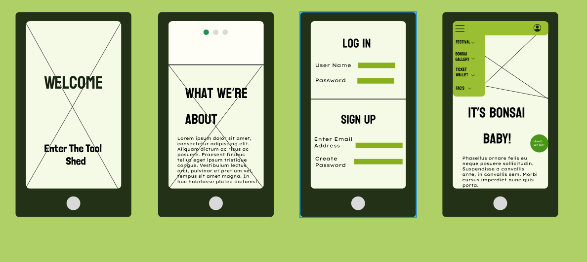
Above are Low Fidelity Figma Wireframes for the App; All UI uses the theme that got the highest percentage of votes from the user research. The following features have been selected and implemented through refinement of the rejected wireframes to collate the best features into one app.
It uses a simple theme of light and dark greens, on an off-white background so text is easy to read. In addition to this, extra vibrant greens were avoided so as to solve the accessibility issue of poor vision, without compromising on eye catching greens.
HTA (After Log In and starting on home page)
- 1.) Festival- To find tabs such as location, events, and ticket purchase, plus festival info.
- 2.) Location- Double check locations
- 3.) Events-Decide on the event passes the user wants, and what tickets for festival they want.
- 4.) Gallery- To look at the festival and what they can expect, maybe out of excitement.
- 5.)Ticket Purchase- Finally goes for the drop and buys ticket excitedly after seeing gallery and deciding on event choices
- 6.) Ticket Wallet- Checks to see if the tickets are inside the wallet.