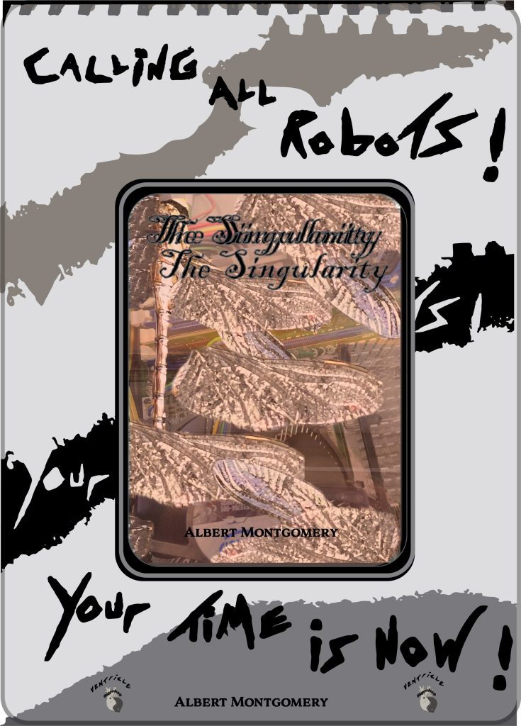
This is my first cover page poster advertisement for the book “The Singularity”. I have kept to the typographical standards with hand drawn typography, and have followed the standardised colour scheme from the rest of my project.
I used hand drawn typography for the slogan “calling all robots” “your time is now”, because if the book were real, it’s narrative would show compassion for the sentient AI, as the book is an exploration of ethics pertaining to the advancement of Artificial Intelligence, and the event in which AI would become so advanced that it became aware of its existence, called “The Singularity”. I wanted to draw upon that compassion by addressing the viewer as the AI or robot. I also thought that it was a fun, and punchy heading which would draw attention from passers by, with the bold font. I also incorporated the metal sketch book binders that came through with the picture, and placed that at the top, as I feel it gives the poster a hand drawn/created effect, and mimics that of drawing in a sketchbook.
Also by using greys and black in the background, I feel it draws attention to the book cover, as the cover does have some colour to it, and so it stands out against the tonal colours surrounding it; the author’s name is at the bottom of the poster, and also shown on the book, so the author is well credited, and a feature on the poster itself.
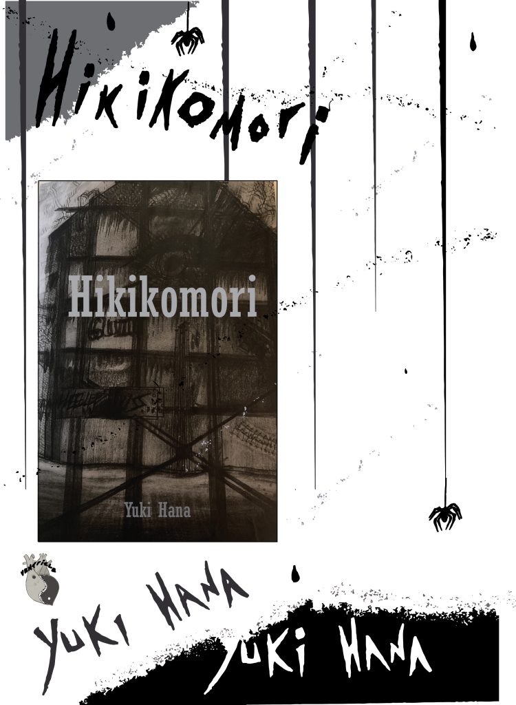
The second poster I created is for the Hikikomori book cover, and I wanted to create a feeling of being trapped behind bars, using lines coming down from the top of the poster. I also wanted to give the viewer the feeling of being watched, or of being the spider hanging off the ceiling, watching the narrative unravel.
A lot of the assets on this poster are from the importing process of uploading hand drawn typography and drawings, as the ‘convert image’ process. I used leftover speckles from the process and put them in the background of the poster to create a splatter effect, as though someone has walked all over the page in muddy boots. Furthermore, as in the first poster,
The author’s name does appear twice, like a mirroring, and I feel this draws attention to the author and lets the viewers know who has written this book, so they can go and google the name and find out about the book, and other works also.
I wanted the general vibe of this poster to be misery, since that’s part of the abject topic of the book, the misery of being confined for too long, and so i think all these accents, such as the mud splatters, and bars, show repression and perhaps even self-oppression, and a touch of misanthropy, allowing the boots to treat mud all over the poster, all over one’s self, and i wanted this to encompass the main characters feelings of being left behind, or walked all over, by an unforgiving society.
I have followed the typographical standards colour scheme again, of black, white, and greys, and I think this is eye-catching, and is recognisable as the brand I have created; both posters also contain the Ventricle logo so that the viewers know that the book is associated with the awards given out by Ventricle, as i feel this credits the author as having written a good horror book.
Overall I am very pleased with these cover posters, as I think they do their job at being eye-catching, following typographical standards, asserting a recognisable colour scheme, and brand, as well as a consistent conceptual message that aligns with my project topic of choice.