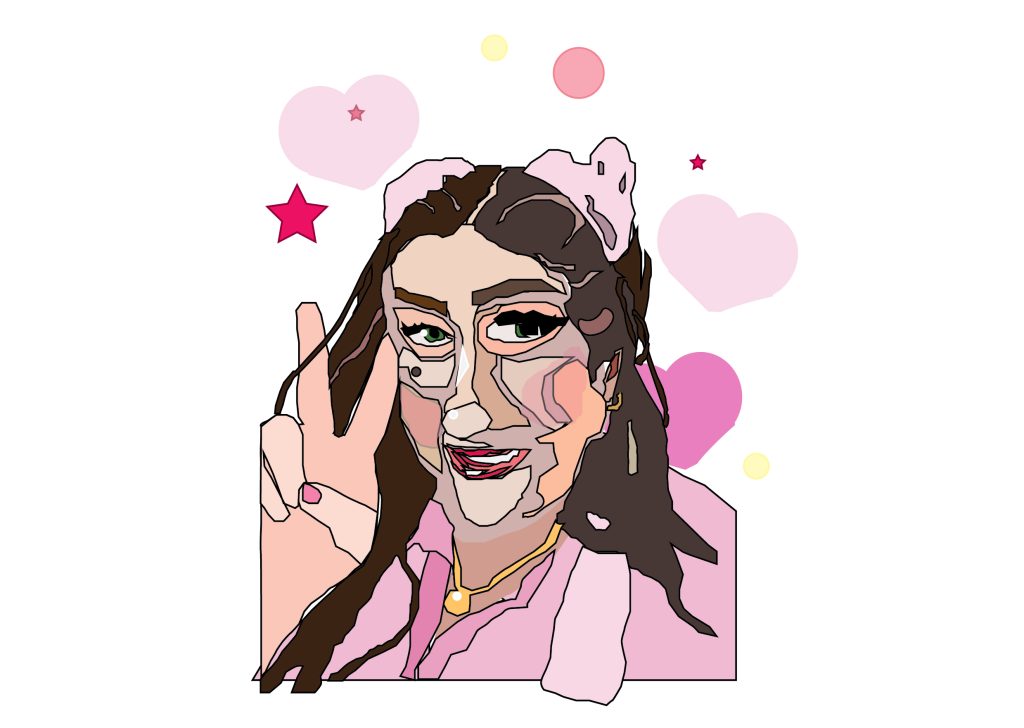
This is my first ever illustrator portrait, and so as I was getting to grips with the process, this is the portrait that happened during that, and so it is experimental, and has an abstract quality to it which looks interesting. In keeping the black outlines on this portrait, it makes it look like a cell shaded character, which are used in certain video games, and I have always liked games so I decided to keep the outlines.
In addition, because of the incongruence of the face shape and length, it looks like a caricature of myself made up from broken shapes fitting together like a mosaic, which has a picasso like effect, which also makes this portrait interesting to look at, and i also like art, so this is relevant to conveying my personality.
Furthermore, my favourite colour is pink, and so i changed the colour of the top i was wearing to match with a colour theme which i felt represented myself, and in the background i also added some simple coloured shapes, of love hearts and stars, as i love the “kawaii”, “fairy keii”, Japanese aesthetic.
As a teenager i would wear rococo style dresses with petticoats, lace edging and big bows, so my love of pink today has been a certain refinement of who i was as a teenager; it has come along with me, although i have toned it down; i think through the pink colours i want to convey how fashion, and colour, has allowed me to explore who i am, and my individuality, and has evolved into who i am today.
I have kept the aesthetic of the portrait in line with this conceptual colour theme, and this reflects through my colour, and background choices.
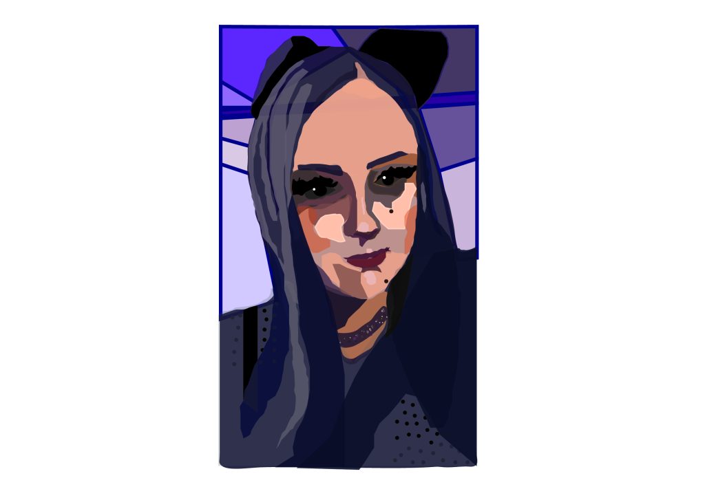
However the portrait is clearly not perfect, and perhaps not professional, and so although I do like it, I think that this skill needs more practice and I would like to create more neat looking portraits, that bare more likeness, in the future.
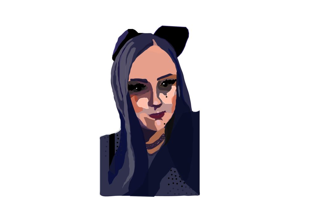
In this portrait i hadi started to understand the process a bit better. It is less abstract and has a lot more detail in the colours and shadows used. I believe this is an example of a radical change in my work, and the differences include more detail, and a different style which doesn’t use the black outlines on the shapes used to create the face, although it is not fully realism, I think it is closer to it than the first portrait.
As the target audience is “the employer”, I think this portrait would be more professional looking, as well as still retaining some of my personality. I wanted to stick with a Halloween conceptual colour theme because this was taken at a Halloween party, and it is my favourite holiday of the year; this reflects dimensions of my personality because I like to embrace the darker parts of my interests such as horror books, films, and art.
Furthermore, I love to do my makeup, and I feel that my face is a canvas which allows me to express myself each day; even when I don’t feel like I can get out of bed, I always end up taking joy in painting my face before I go outside. It is an art form, and I tried to convey that by breaking down the blending into block colours.. It takes me up to 1.5 hours to do a full face of this style of makeup, and i did not, in fact, “wake up like this”, i put in time and effort into this art form and i think that in showing it in a more broken down way, it reflects my personality and my dedication to an art form that i love very much.. It gives me strength when I don’t have it, and shows that I am a resilient girl.
Finally, I added a geometric background, in Halloween purple shades to create an aesthetic colour theme, and to make it look more professional.