Conceptual Design is the displaying of an integrated design process or message, in which, a graphical piece (typography, logo, ect) incorporates a specific messages pertaining to their intended purpose.
Webflow defines conceptual design as this “Conceptual design creates a strategy to transform a concept or idea into visual media. It’s the underpinning of a successful design process, and no project can start without it.” (Webflow, N.D, Conceptual Design: What it is and How to Build It, Available Online: https://webflow.com/blog/conceptual-designer#:~:text=Conceptual%20design%20creates%20a%20strategy,a%20completed%20project%20may%20look. [Accessed 03/11/2023])

This is a design by graphic designer Gary Dimi Pohty, it is a 2D graphic design which uses conceptual design to create a hidden meaning in the image. The design has a title which says ‘the third child’, which means the logo is about something which is about a third child.
It has the silhouettes of two children who appear to be playing a game together, they are on top of a grey background, which has allowed the designer to create a third outline through the placement of the two outlines already there. In the outline there is the body of a third child, which fits with the title text, because it is about a third child.
It is effective because it gets the concept across that this is about three children, and as such, displays the third child through double meaning. It also allows for the viewer to further conceptualise what this is about, what is the story about this other child.
It also appears that the shape of the third child looks to be making a praying sign, because the other children’s hands go over them, and because they are the light colour, it looks like the third child’s hands are in the foreground praying. It could conceptualise that maybe the third child is being left out of this playing with the other children, and has a darker feel to it that maybe it could have been designed for a book or film with serious themes.
All of this is done through the use of two shapes that have fitted together to make a third shape, and an additional meaning from the original shapes. Overall, It makes you think when you look at it which means that it is an effective use of conceptual 2D graphic design, and it is engaging to the viewer through its use of conceptualisation, which is the ulterior goal of this type of design work.

Conceptualised Design
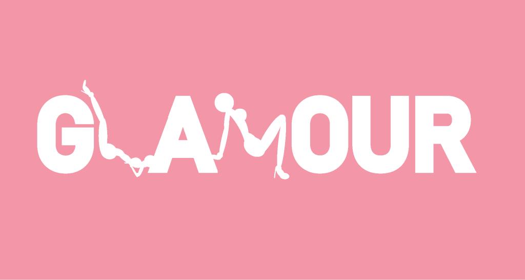
I have decided to redesign Glamour magazine’s logo and to make it more conceptual. I created some clinking champagne glasses and fit them inside the letter ‘A’, as champagne and champagne flutes are connotative of glamour and a classy lifestyle. I also wanted to make it the same colour as the background colour so it kind of looks like it’s been carved into the letters.
I also added some girls doing some well known glamour model poses to show that the magazine is about glamour, and incorporated these inside the letters also. I wanted to fit them inside the word itself to give the logo some further conceptualised meaning, than just having the word on its own. I think that this lets the viewer know on first glance, that this magazine is meant for femme presenting individuals and those interested in things such as lifestyle, makeup, skincare, clothes, and fashion.
I used the silhouettes of a hyper feminine figure to attract readers attention to the logo and to give it a second glance to see the figures and the champagne flutes inside.
In conclusion, the logo looks better having some conceptualised meaning added to the words itself and I also think that the pictures make the logo much more memorable,and having a memorable logo is essential to building a well known brand.
I think it could also help femme presenting people to feel unified and empowered over their own sexuality and to feel more comfortable in their femininity in daily life, as I think it is important to have unified places to talk about women’s rights, such as magazines, and online blog posts. This logo could be used for their website as well as their print media, in addition to being used on posters and billboards. I think it is a bold conceptualised logo that incorporates a shock factor to gain attention from the reader/viewer.
Harvard References
| C Lane 2018, Logos In The News, Magazine Updates, Available Online: https://www.logolounge.com/articles/magazine-updates [Accessed 2023] |
| R Lisickis, 2021, This Graphic Designer Has an Eye for Hidden Meaning (30 logos). Available Online: https://www.boredpanda.com/minimalist-negative-space-hidden-meaning-logos-gary-dimi/ [Accessed 22/10/2023] |
| (Webflow, N.D, Conceptual Design: What it is and How to Build It, Available Online: https://webflow.com/blog/conceptual-designer#:~:text=Conceptual%20design%20creates%20a%20strategy,a%20completed%20project%20may%20look. [Accessed 03/11/2023] |
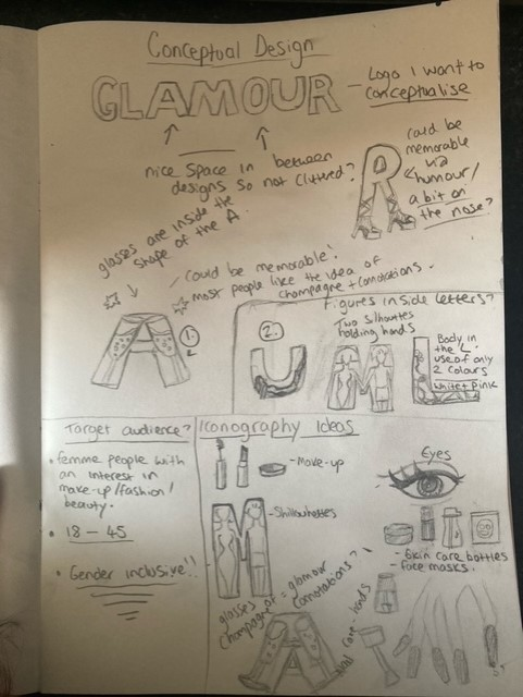
Sketchbook Notes